Loading component...
At a glance
Data visualisations are important because they can reveal insights that would otherwise be hard to identify in reports. Excel’s many data visualisation options include charts, sparklines, conditional formats, icons and even emojis.
This article uses sales information from July 2021 to October 2023 as the data source for the reports. The reports compare the current month to the same month from the previous year.
Although this example compares months, the techniques can be applied to comparisons between any two metrics, such as actuals versus budget.
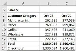
The report in Figure 1 is used to create the first chart.
Number formats
By default, Excel charts use the number format from the data source. This is still the case after the chart has been created. The chart number format can be changed by altering the data source format.
Recommended charts
Excel has a built-in chart recommendation feature. To use it with this data, the user would:
1. Select the range A7:C12.
2. Click the Insert ribbon.
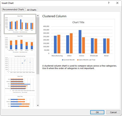
3. Click the Recommended Charts button – see Figure 2.
4. Clicking a chart on the left of the dialog will display a sample chart on the right, with a brief description underneath. This is a quick way to preview multiple ways to visualise the data.
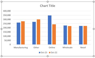
5. With the first chart selected, click OK. See Figure 3 for the result.
For people who are colourblind, blue, orange and grey are considered “safe”, or accessible, colours to use.
The chart uses the same sequence as the report. While it is common to place the current data on the left of the report, this leads to a problem in the chart.
Date-based information is typically read from left to right. The current month is shown first, so it looks like Online sales have fallen, when Online sales have actually risen dramatically.
For the purposes of this chart, the user must reverse the order of the columns in the report and recreate the chart. See Figure 4 for the adjusted report and chart.
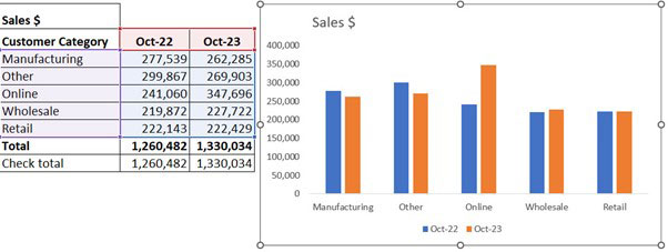
The chart’s title has been updated and the gridlines have been removed. Removing the gridlines reduces clutter.
It’s now clear that Online sales increased significantly, while sales in the Manufacturing and Other categories fell slightly. Wholesale and Retail sales remained about the same.
Variances
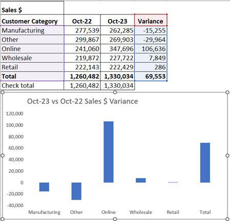
Rather than plot both metrics, users could opt to focus on the movement or variance. See Figure 5 for the modified report and chart.
The chart in Figure 5 focuses on the movement between the two measures. The Total can also be included because variance has been plotted.
If the variances were all in the same direction, then including a total may not be worthwhile. The total variance could affect the scale of the vertical axis. That is why the total is not included on the initial charts.
Positioning horizonal axis labels
In Figure 5, the horizontal axis labels are not positioned next to the zero axis. When there are negative variances, this can make the labels hard to read.
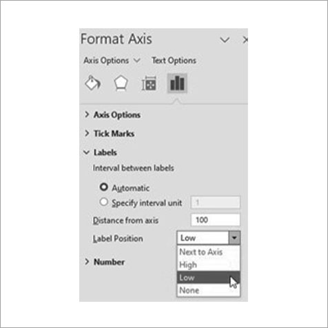
There is a setting that allows users to change the position of the axis labels:
1. Right-click the horizontal axis.
2. Choose Format Axis.
3. The Format Task Pane will open on the right of screen. The Label Position setting to change is shown in Figure 6.
Separate ranges
The chart in Figure 5 has data source ranges – the coloured ranges at the top left – that are separate. To select separate ranges:
- Select the first range as normal (A7:A12) with your mouse.
- Hold the Ctrl key down and select the second range (D7:D12).
- Create the chart using the separate ranges via the Recommended Charts button.
Percentage variance
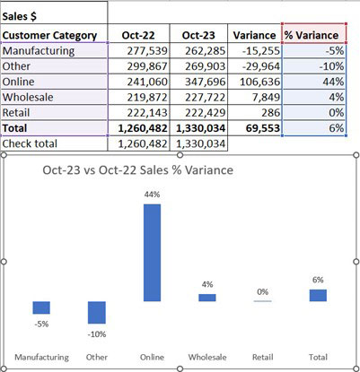
An alternative to a $ variance is a percentage variance. The previous year’s month value is the base, and the percentage variance is calculated from the base. See the percentage variance chart in Figure 7.
This chart shows additional changes. The vertical axis has been removed and data labels have been added to show the percentage movement. These changes reduce the clutter and make it easier to read and understand.
Trial and error
Experiment with adding and removing different parts of the chart to see the effect. Even removing lines can simplify the chart. The charts in Figures 5 and 7 do not include a horizontal axis line.
Sparkline charts
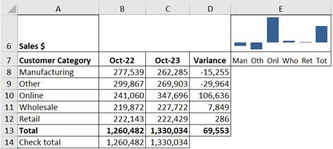
If space is at a premium, consider using a sparkline chart. Figure 8 replicates the chart from Figure 5 with a sparkline chart in cell E6.
Sparkline charts are simple, cell-based charts that have a single data source range.
To create the sparkline with this data:
- Select cell E6.
- Click the Insert ribbon tab.
- Click the Column button in the Sparklines section – this is to the right of the Charts section.
- Select the range D8:D13 and click OK.
The abbreviated axis headings in cell E7 were created with the following formula:
=TEXTJOIN(" ",1,LEFT(A8:A13,3))
The LEFT function extracts the first three letters from each Customer Category plus the Total. The TEXTJOIN function combines all the three letter names with a space between each. Making column E as wide as the abbreviated names lines up them up with the Sparkline columns.
Waterfall chart
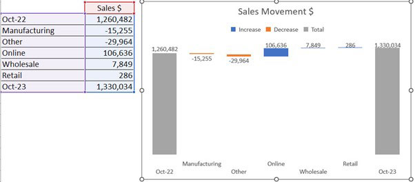
A waterfall or bridge chart can also be used to visualise changes between two metrics. It is similar to the variance chart in Figure 5, but also includes a column for each total. This provides a comparison of the size of the movements compared to the totals.
The structure required and the waterfall chart is shown in Figure 9.
Conditional formats
When working with a large quantity of numbers, consider applying conditional formatting via the Home Ribbon, instead of a chart.
Figure 10 shows an extract from a Customer report. The Data Bars conditional formatting has been applied to the variance column.
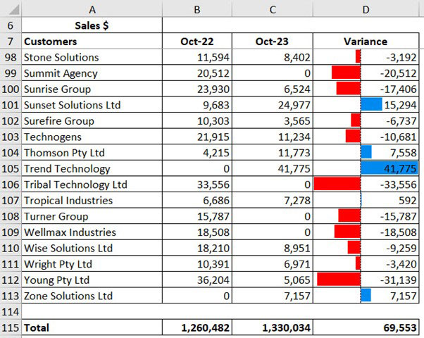
The size and colour of the Data Bar signals the size and direction of the change in values on a line-by-line basis. A quick scan down the list can quickly identify the large movements in both directions.
Exception reporting
Icons can also offer a simple data visualisation, but the number of icons used should be minimal. They are best used to focus attention on something important.
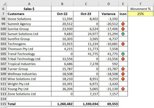
Rather than use an icon on every row, users could set a parameter to only show an icon if the value is above or below the accepted levels. Figure 11 shows an icon on the customer row, which identifies sales that have increased or decreased more than 25 per cent (cell F7). Movements between -25 percent and +25 percent have no icon.
This result can be achieved by using a formula in the icon column. Icons are easier to control via a formula than with the icon interface alone. The formula and conditional formatting will be explained in the companion video.
Avoid icons that only have a colour (like a traffic light report), because they are not accessible for colourblind people and cannot be distinguished if a report is printed in greyscale. Instead, display descriptive icons such as arrows, ticks and crosses with colour.
Emojis
Emojis are another option if Excel’s icon set is not extensive enough.
Each emoji is treated as a character. To access emojis:

1. Press the Windows key and the full stop key – see Figure 12.
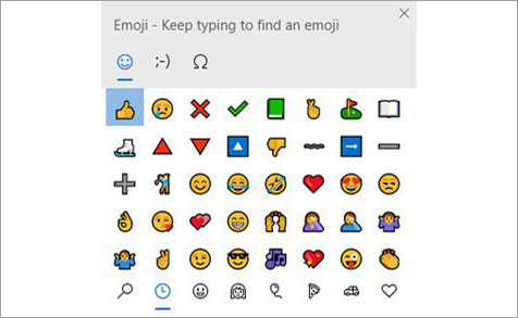
2. This opens the Emoji dialog– see Figure 13.
3. Click the icons at the bottom of the dialog to access different categories.
4. Click the desired emoji to insert it into the cell.
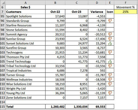
In Figure 14, the icons have been replaced by emojis. The emojis are displayed via a formula, and emojis in formulas take on the font colour. Conditional formatting has been used to change the emoji colour.

