Loading component...
At a glance
Question
In Excel, can I create a single chart that has both full year and monthly measures?
Answer
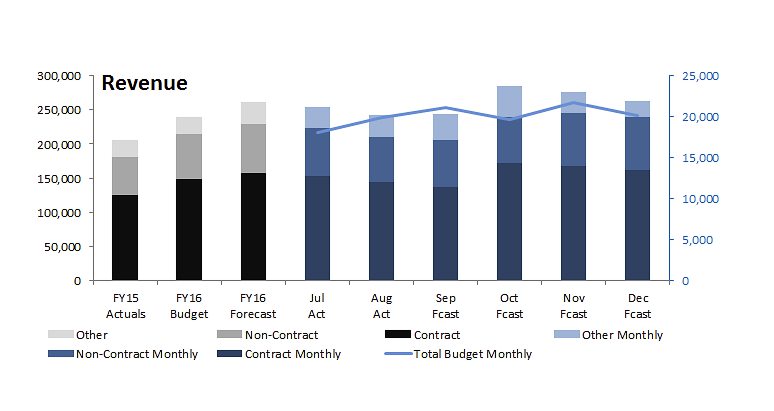
Normally I advise against having full year and monthly data on the same chart as the difference in values (full year vs month) can make the chart hard to interpret. The layout requested intrigued me and the hand-drawn chart is replicated in Figure 1.
Achieving the final result involves a few techniques which can be useful when creating other charts. Basically it is a two axis chart that combines stacked column charts with a line chart. (Due to space restrictions I’ve only plotted the first six months of the year here)
We are charting Sales data that is split between three revenue types: Contract, Non-Contract and Other. The first three Stacked Column charts measure the last full financial year (FY15); the approved budget and the current full-year forecast. These are measured on the left-hand vertical axis.
The remaining six Stacked Column charts measure the monthly actual and forecast sales. These are measured against the right-hand vertical axis. The Line chart shows the total monthly sales budget, also measured on the right-hand vertical axis.
I have used colours to help identify which chart is related to which axis. This chart works because of the layout of the data. Figure 2 shows that layout.
This appears different to most chart tables. Since we are including three separate charts on one chart we need to separate those three parts to control their position. Rows 1 and 2 are helper cells that allow us to create the headings in row 3 in columns E to J.
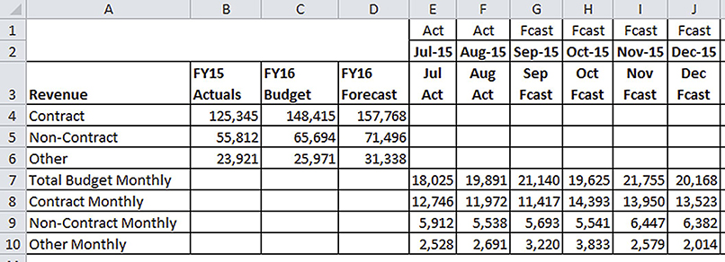
Excel doesn’t provide a lot of flexibility in moving the data on a chart. You need to set out the data to create the layout you want to achieve in the chart. In the table the blank cells are as important as the value cells in terms of getting the layout correct.
This article will cover the steps required to create the chart. The screen shots are from Excel 2010. These instructions broadly apply to Excel 2007 and Excel 2003. Instructions for Excel 2013 can be found at the bottom of the page.
Instructions
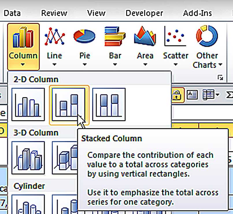
1. Select the range A3:J10. Click the Insert ribbon tab and click the drop down in the Column icon and choose the Stacked Column icon as per Figure 3.
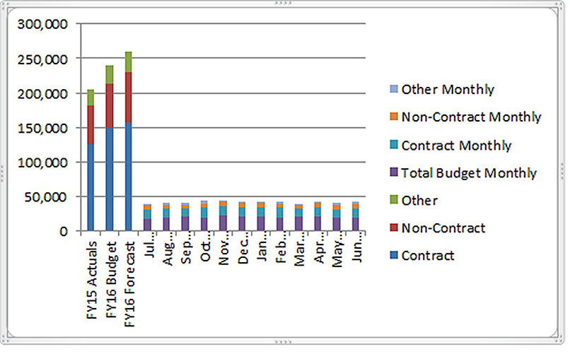
2. The default chart layout will display as per Figure 4. The remaining instructions assume the chart is selected.
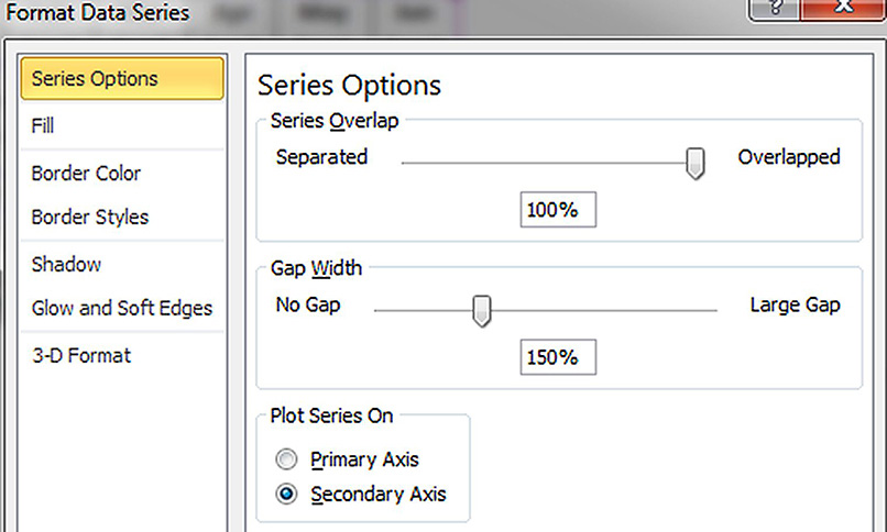
3. Right-click one of the bottom segments (Total Budget Monthly) in the six columns on the right of the chart and choose the Format Data Series. In the dialog select the Secondary Axis option and click Close – see Figure 5.
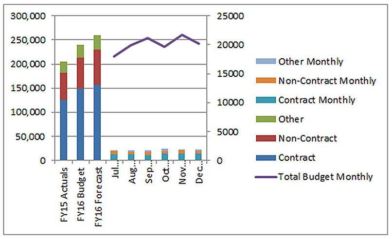
4. Right-click one of the six columns on the right of the chart. Click the Change Series Chart Type and select the first Line chart. The chart should now look like Figure 6 (on opposite page).
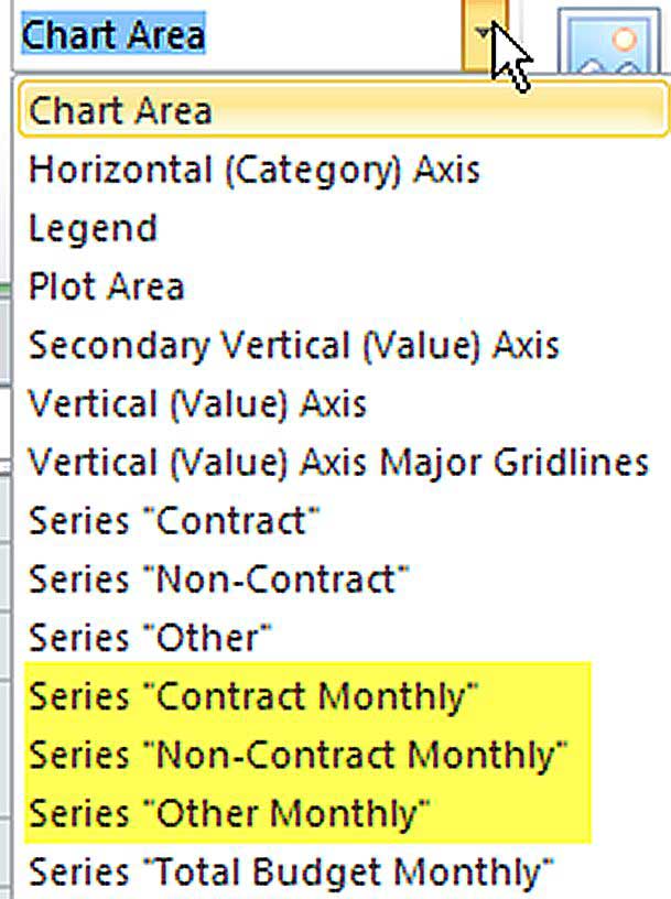
5. We need to select each of the three remaining segments in the Stacked Column charts on the right. This can be difficult with the mouse as they are so small.
The easier way to do it is via the drop down on the far left of the Layout ribbon tab. This drop down lists all the parts of the chart. We will need to modify the three data series highlighted in yellow at the bottom of Figure 7.
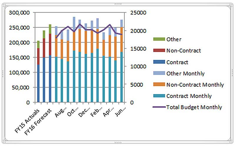
6. For each of the three data series in Figure 7 we need to plot them on the secondary axis as we did with the Total Monthly Budget in step 3, Figure 5. Once selected, click the Format Selection icon immediately below the drop down. Make the change to the Secondary Axis as shown in Figure 5 and click Close. After doing this for each of the three data series, the structure of the chart is complete as per Figure 8.
The remaining instructions relate to amending the layout and colours of the chart in Figure 8 to match Figure 1. I prefer using shades of the one colour for the Stacked Column charts, to make it more readable.
7. Right-click the Legend and use Format Legend to amend its position to display on the bottom. Amend the Legend size.
8. Increase the size of the Chart plot area.
9. Right-click each segment of the stacked charts and use the Shape Fill icon to amend the colour. This will require six separate colour changes.
10. Right-click the right vertical axis and use the Font Color icon to change the colour.
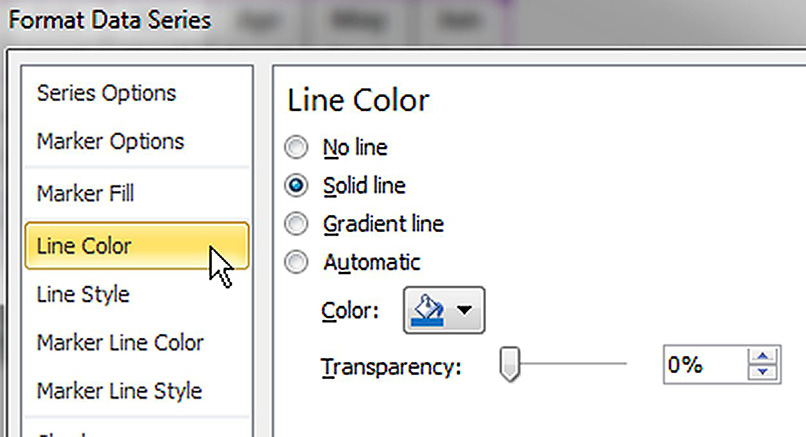
11. Right-click the Line chart and select Format Data Series and change the Line Color settings as per Figure 9.
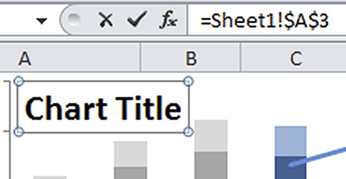
12. Lastly, click the Layout ribbon tab then click the Chart Title icon to add a Chart Title. With the Chart Title selected, click in the formula bar and press the = sign and click cell A3 and press Enter – see Figure 10. This creates a dynamic Chart Title linked to cell A3.
There is one small aspect of the chart table that deserves further explanation. The month names in row 3 are followed by Act Forcast to differentiate between actual and forecasts. To force them to appear on the line below the month name, I have used a formula in cell E3 that has been copied across.
The formula is: =TEXT(E2,”mmm”)&CHAR(10)&E1
The TEXT function displays the three-character month name. The & symbol joins text together. The CHAR(10) function represents a line break (like the Wrap Text format) and forces a line break after the month name. This makes the display on the chart more consistent. Row 1 could contain a formula to update automatically as the year progresses.
Excel 2013 Chart Instructions
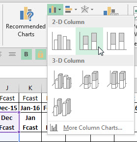
1. Select the range A3:J10. Click the Insert ribbon tab and click the Column chart icon as per image below and choose Stacked Column – see image below.
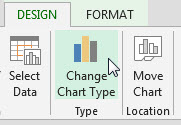
2. With the chart selected click the Design ribbon tab and click the Change Chart type icon.
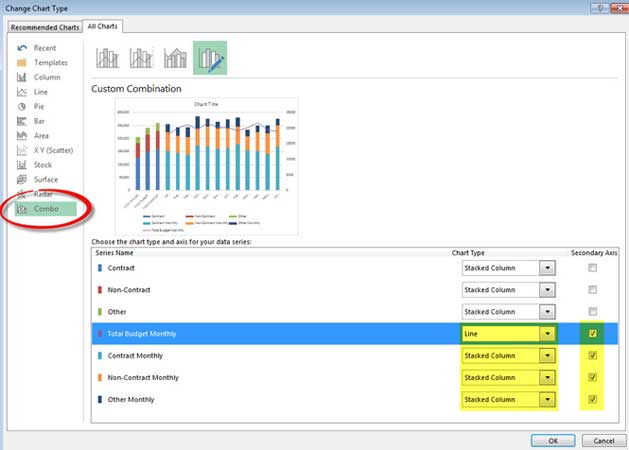
3. Increase the size of the dialog that opens and make the following changes. See image below.
4. Click the Combo option - bottom left. Change the top item (Contract) via the Drop down to a Stacked Column. Change the last four data series to all use the Secondary Axis – check box on right.
5. Ensure the Total Budget Monthly is a Line chart.
6. Change the bottom three Data Series to a Stacked Column. Click OK.
7. Right click each of the column segments and use the Fill colour option to change their colours to match the final chart. Right click the Line chart and change its colour to blue.
8. Right click the right axis and change the font colour to blue.
9. The Chart Title instructions in step 12 in the main article apply to Excel 2013.
Use this spreadsheet to practice these techniques.
Neale Blackwood CPA runs A4 Accounting, providing Excel training, webinars and consulting services to various organisations. Questions can be sent to [email protected]
