Loading component...
At a glance
Sparkline charts were introduced in Excel 2010. The chart and term were created by Edward Tufte, a data visualisation author. Sparklines are on the Insert ribbon, to the right of the Charts options. Sparklines are separate and different to Excel’s standard charts.
A sparkline chart is a cell-based chart that plots a single data series. The chart resides in a cell, and changes its size based on the cell height and width. Figure 01 has examples of sparkline charts.
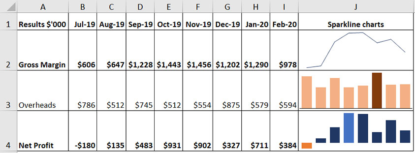
There are three types of sparkline charts: line, column and win/loss. The win/loss chart has limited use in a business setting.
While sparklines are ideal for dashboards and other reports, there are times when you would prefer to plot more than one data series.
A common requirement is to add a target or banding to represent acceptable results. The technique can be applied to standard charts as well as small charts. The instructions apply to Excel 2013 and later versions.
Worked example
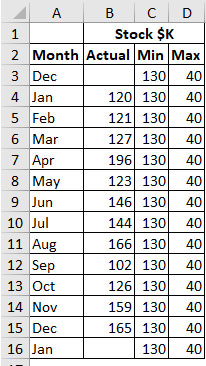
The table in Figure 02 has actual stock figures listed against the target minimum and the incremental amount for the maximum.
The stock value needs to be kept above the minimum value of $130,000. The maximum value is $170,000. The final chart will use a stacked area chart. This type of chart requires the incremental amount of $40,000 (added to the minimum value) needed to reach the maximum value.A sparkline is built to reside in a cell. It’s possible to create a standard Excel chart and place it within a cell, and have it resize with the cell. This requires removing most of the chart elements to leave just the required data series. By doing this, we can emulate a sparkline and include two or three data series.
We will start by creating a small chart with two series – actuals and target minimum.
- Select the range A2:C16.
- Click the Insert ribbon and choose a Clustered Column chart.
- Right-click the left axis and choose Format Axis. In the task pane on the right, change the Maximum option to 220.
- Right-click any of the columns and choose Change Series Chart Type.

- In the dialog that opens, click the drop-down for Min, choose a Stacked Area chart and click OK. See Figure 03.
- We need to remove all the elements of the chart. Click the plus sign near the top right corner when the chart is selected, and untick all the items.
- Select the Minimum area and use the Fill Color icon on the Home ribbon to change the colour to a light grey.
- Make the plot area the same height as the chart. Click the chart and select the plot area and use the handles (small circles) to click, hold and drag the top and bottom lines up and down.
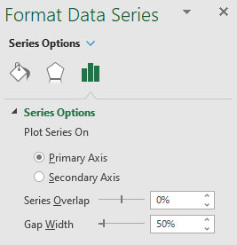
- Select the blue columns and press Ctrl + 1 (use the 1 on the keyboard, not the numeric keypad). This opens the Format Data Series task pane on the right and allows us to modify the data series using the Series Options. Change the Series Overlap to 0% and the Gap Width to 50%. This makes the columns wider. See Figure 04.
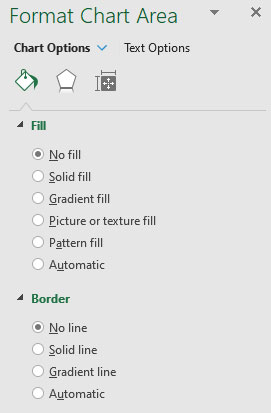
- Click the outer line of the chart and, with the chart selected, change the Chart Area options in the task pane on the right to No Fill and No Line as per Figure 05.
- The chart is ready to copy to a cell. Copy the chart.
- I have created a report on a separate sheet to insert the chart. Select the cell and paste. The chart will be much larger than the cell, but the top left corner of the chart will line up with the top left corner of the cell.
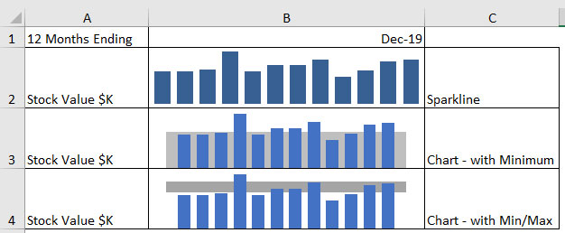
- Hold the Alt key down and use the mouse with the icon at the bottom right corner of the pasted chart to drag and resize the chart to the cell size. By holding down the Alt key, you will be able to resize the chart to precisely the size of the cell. The Alt key enables the “snaps to” feature that lines up the chart’s borders with the sheet gridlines. Figure 06 shows the chart in cell B3 compared to a sparkline in cell B2 for the same series. We will now create the chart shown in row 4.
- Copy and paste the initial full-size chart. Note the colours around the source data range on the sheet. Point to the bottom right corner of the highlighted range, and use the mouse to drag the double-headed arrow icon to the right to include the Max column.
- This will update the new chart. Right-click one of the data series, select Change Series Chart Type, change the Max series to a Stacked Area and click OK.
- If you change the fill colour of the bottom Minimum area to white, then this has the effect of providing a banding effect on the chart. You can copy the new chart to cell B4 and resize as before.
This technique can be used on standard Excel charts to create the banding effect.
Rows 3 and 16 in Figure 02 are placeholder rows. They ensure the stacked area chart surrounds the column chart. If you don’t use these extra rows, the stacked area chart stops halfway across the first and last column chart, and the result is unappealing. This issue will be demonstrated in the companion video.
Compared to what?
This a great question to ask when creating charts. Including the answer on your chart may improve it. A single data series like a sparkline chart is improved when compared to something, in this case minimum and maximum target values.
The companion video and Excel file will go into more detail to demonstrate these techniques.
Neale Blackwood CPA runs A4 Accounting, providing Excel training, webinars and consulting services to organisations around Australia. Questions can be sent to [email protected]

