Loading component...
At a glance
QUESTION
How do you make a waterfall chart in Excel?
ANSWER
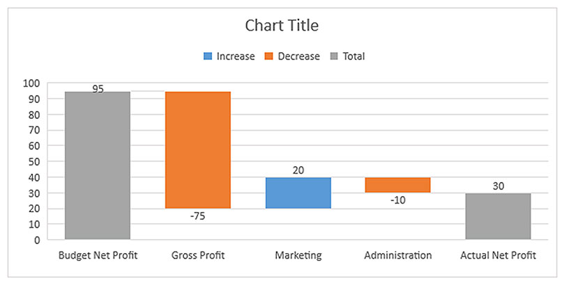
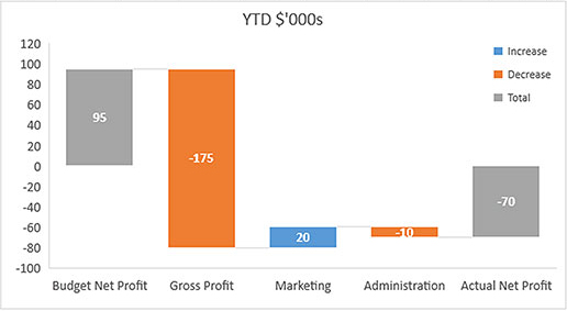
The answer used to be with great difficulty, but Excel 2016 changed that. After many years, Excel has a few new charts, and a waterfall chart is one of them. A waterfall chart helps visualise the differences (variances) between two values. A simple example of a waterfall chart is shown in Figure 1.
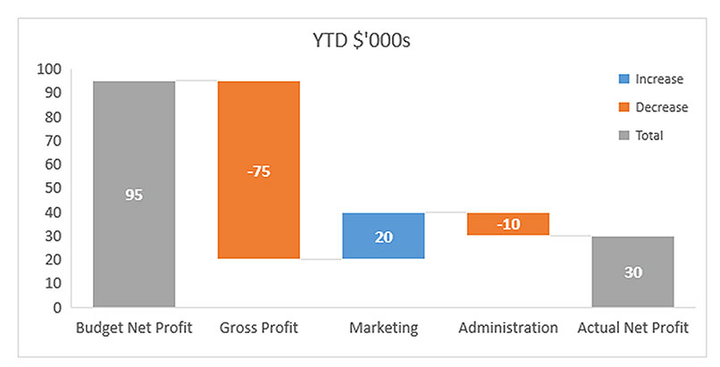
The two column charts at each end (in grey) represent the two measures being compared. The columns between them are the variances between actual and budget results that affect net profit. The colour of the middle columns shows either an increase (in blue), or decrease (in orange). In this example, an increase is a favourable variance – something that increased net profit. A decrease is an unfavourable variance, something that decreased net profit.
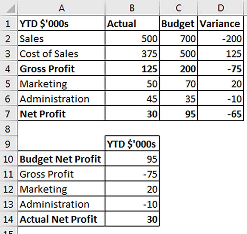
The chart in Figure 1 is meant to be read from left to right. The budgeted net profit was $95,000. The gross profit result was $75,000 below budget, which dropped net profit to $20,000. Marketing was $20,000 better than budget so it raised net profit from $20,000 to $40,000. Administration was $10,000 worse than budget so it brings the net profit down from $40,000 to $30,000, which is represented by the last column, actual net profit. These variances are reflected in Figure 2.
When choosing colours for your waterfall chart, keep in mind that about 8 per cent of males have some form of colour blindness, with red and green colour blindness the most common.
The following instructions will help you create the waterfall chart in Figure 1 using Excel 2016. The companion video to this article on intheblack.com will also include instructions to make a waterfall chart using previous Excel versions, which are much more complex.
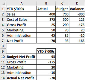
Figure 2 shows the report (at top) that is the basis for the chart, and the layout (at bottom) that makes creating the chart easier. The cells in the layout (at bottom) are linked to the report at the top.
Select the range A10:B14, click the Insert ribbon tab, then click the Recommended Charts icon and click the All Charts tab. On the bottom left-hand side, click waterfall, then click OK. Figure 3 shows the resulting chart.
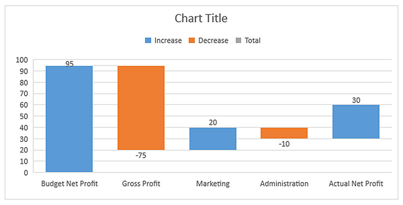
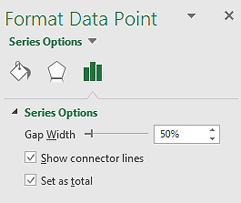
This is not yet the chart we require because the first and last columns are not defined as totals. To fix that, make sure the chart is selected and double-click the first column. Right-click the selected column and choose Format Data Point. This opens the Format Pane on the right of the screen. Tick the box for Set as total, as shown in Figure 4.
Repeat that process for the last column. The resulting chart is shown in Figure 5.
Next, change the Chart Title to YTD $’000s and the structure of the chart is done. All that remains are formatting changes.
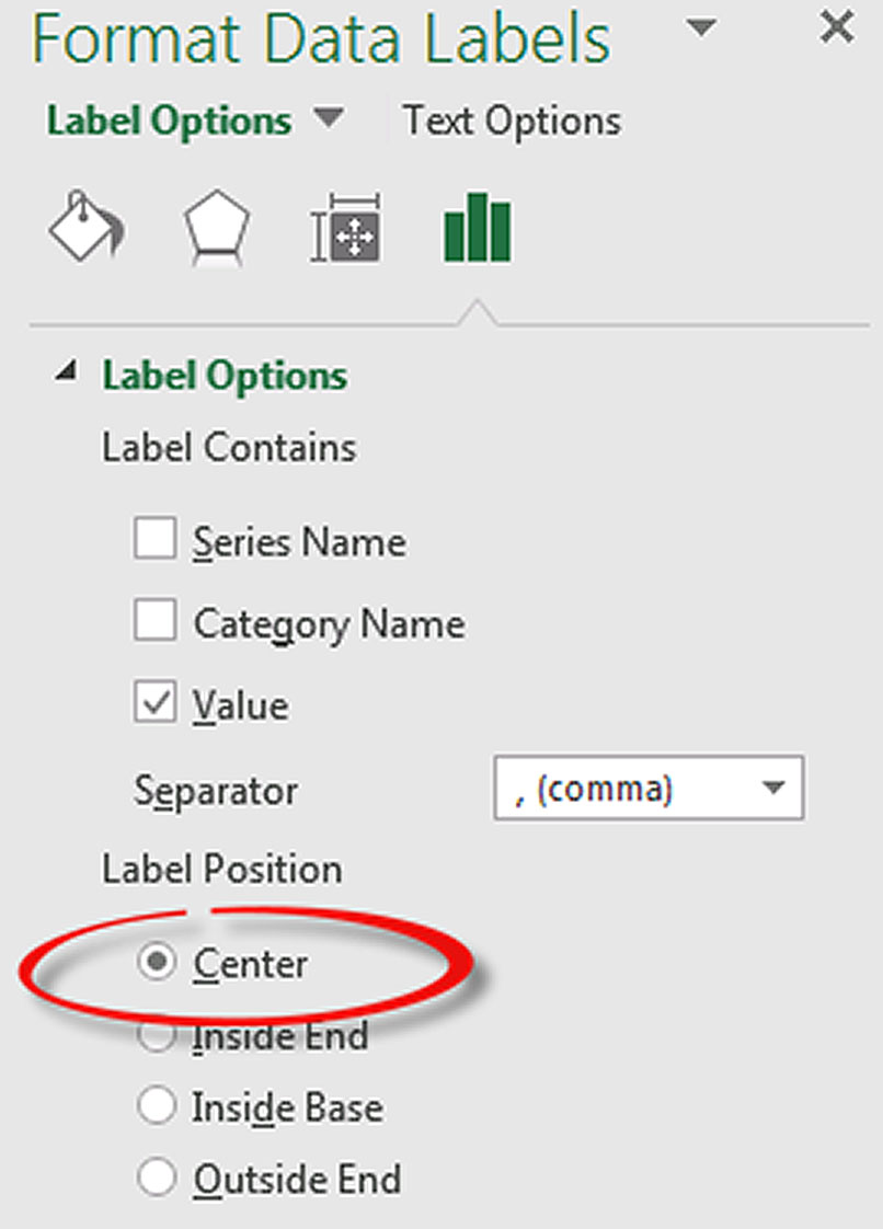
Right-click any one of the data value labels (the numbers above and below the columns) and choose Format Data Labels. In the Format Pane on the right of screen, choose the Center Label Position as shown in Figure 6. With the labels still selected, change the font colour to white, make the font bold and increase the font size. You can use the formatting tools on the Home ribbon to make these changes.
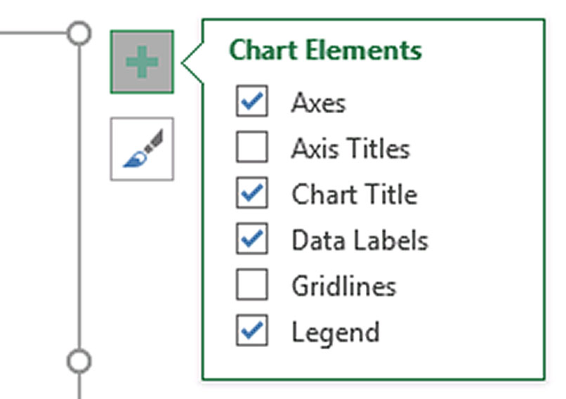
I usually remove the chart gridlines as it makes the charts look cleaner. To do this, click the green plus sign at the top right of the chart when the chart is selected and untick the Gridlines option, see Figure 7. You can also select the gridlines on the chart and press Delete on the keyboard.
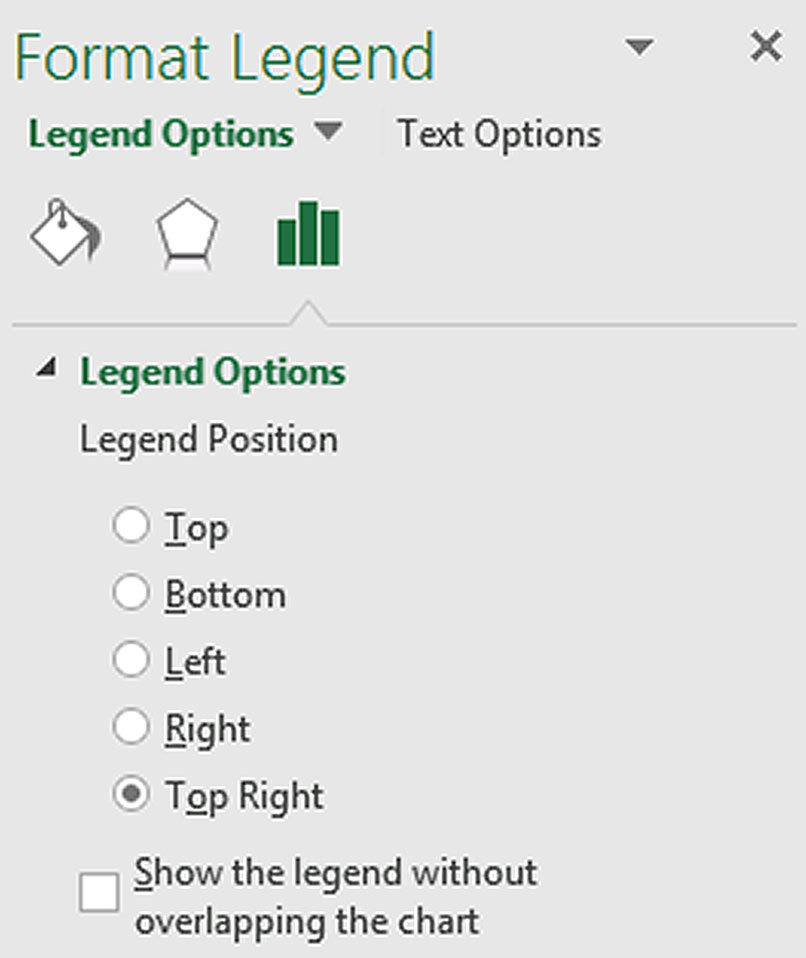
Next, move the Legend to the top right. Right-click the Legend and choose Format Legend. Under Legend Options, select the Top Right button. You can also unselect the bottom option (Show the legend without overlapping the chart), as per Figure 8.
Unselecting this option increases the size of the chart plot area.
Finally, increase the font sizes on the bottom and left axes and the chart is complete.
The waterfall chart handles situations where the columns go below zero. For example, if I change the sales value in cell B2 to 400 (Figure 9), without changing anything else, this will cause a loss. Figure 10 shows the result.
The companion video and Excel file will go into more detail to demonstrate these techniques.
Neale Blackwood CPA runs A4 Accounting, providing Excel training, webinars and consulting services to organisations around Australia. Questions can be sent to [email protected]

