Loading component...
At a glance
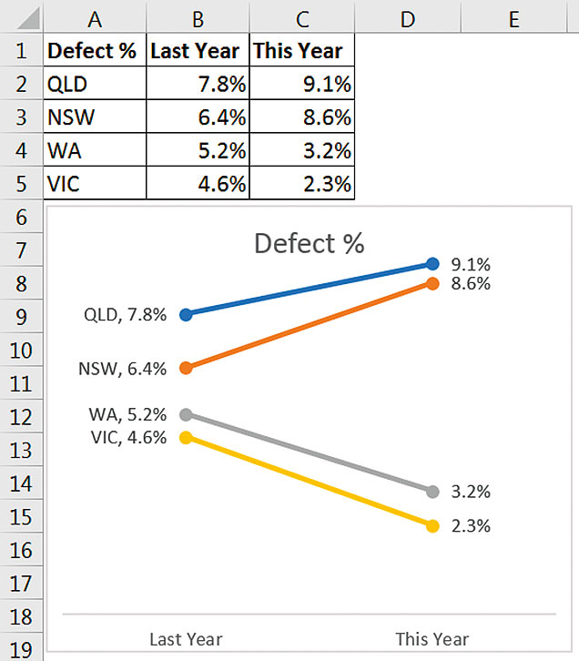
In the June 2018 article, I demonstrated a variance chart that compared actuals to budget. When comparing two metrics over time and across multiple categories, you might consider using a slope chart. The slope chart is typically used to show movement between two periods. Let’s say we want to track the defect percentage from last year to this year in different states. Figure 1 (right) has the table and its associated slope chart.
This chart is easy to read and understand.
Unfortunately, a slope chart is not a default chart in Excel. You might think it is a default line chart; if you plot two or three time periods, Excel defaults to using a slightly different layout. Figure 2 shows the default line (with markers) chart layout that you achieve when you select the range A1:C5 in Figure 1.
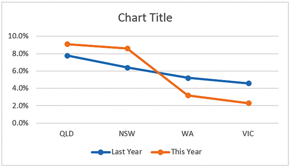
The states are listed on the bottom axis, which is not what we want. We can amend this chart to create a slope chart.
Excel versions
Excel changed its chart interface in Excel 2013, and these instructions apply to Excel 2013 and later versions. A slope chart is possible in previous versions, but the interface is different. With the chart selected, we can convert the default line chart in Figure 2 into a slope chart by clicking the Design ribbon tab, then clicking the Switch Row/Column icon.
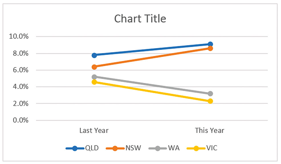
This creates a layout that looks like the slope chart, but has a number of extra chart elements that we can delete. Figure 3 shows the amended default chart.
We can improve readability by removing some of the chart elements in Figure 3.
Removing chart elements
When you initially create a chart, it is worthwhile experimenting by removing elements and seeing if the overall message of the chart is affected. In our case we want to show which state belongs to which line. A legend isn’t always the best way to do that.
Compare Figure 1 and Figure 3: how much easier is it to read Figure 1 because the labels are next to the lines? In Figure 3 you need to switch between the legend and the lines. Adding labels to a line chart can make them easier to read.
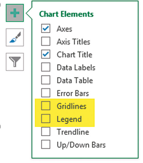
With the chart selected we can click on the plus sign on the top right-hand corner and untick the Legend and the Gridlines – see Figure 4.
Since we are adding data labels, we can also delete the vertical axis on the left by selecting it and pressing Delete on the keyboard.
We need to add data labels to each of the lines. This is a repetitive task since you can’t add labels to all the lines in one step. You must add the data labels one line at a time. We also have a slightly different label on the first (left) point compared to the second (right) point. The first point has the series name and value. The second point only shows the value.
To add data labels to a line, right-click the line and select Add Data Label. Repeat this for each line.
The first (left) data label on each line needs the series name and to be placed on the left of the line.
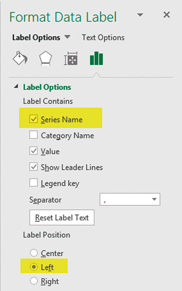
It is possible to format an individual data label. To do that, click the data label once and then click it again. With a single data point selected, press Ctrl + 1 to format it. This will open the Format task pane on the right-hand side of the screen. We need to select the Series Name option and the Left option under Label Position – see Figure 5.
Repeat this for the other three lines. The task pane will remain visible on the right, allowing changes to the settings once each data point is individually selected.
Lastly, we can link the chart title to cell A1. Click the title on the chart. Click in the Formula bar and press = and then click cell A1 and press Enter.
Slope chart issues
To ensure the slope chart and the data table line up, sort the table in descending order in the Last Year column.
Slope charts have issues when there are values that are close to each other either on the left or right-hand side. Labels can be obscured, making them hard to read. The solution is to either:
- use rounding to ensure that the values are the same, or
- increase the height of the slope chart so that the points move apart to make them easier to read.
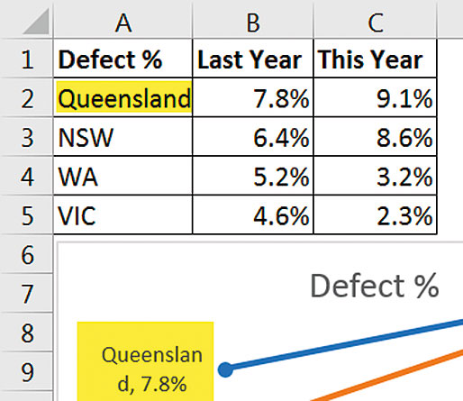
A long series name can cause Excel to automatically wrap the name over two lines. This may not be the effect you want – see Figure 6 for an example. To fix this, make the chart wider.
Slope chart suggestions
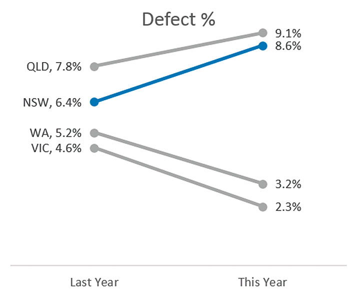
To draw attention to a particular line on a slope chart, you can make all the other lines the same colour, for example, grey. You can use blue to emphasise the line you want to draw the reader’s attention to. This may sound simple, but unfortunately it does take a few clicks to achieve. The reason is that Excel allows you to format the line colour, the marker point colour and the line around the marker point. Hence, it can take three changes per line to achieve a consistent colour on the line. Figure 7 highlights the NSW result.
Chart macros
As we have seen, creating slope charts can be time-consuming. To simplify and speed up the process, I have created a macro that is in the example file.
Switch Row/Column icon
This icon, in the Design ribbon tab when a chart is selected, is useful whenever you are creating a chart. Switching between row and column can sometimes provide a better chart visualisation. Clicking the icon again reverts to the default chart. It is a simple step that may provide you with a better chart to get your message across.
The companion video and Excel file will go into more detail to demonstrate these techniques.
Neale Blackwood CPA runs A4 Accounting, providing Excel training, webinars and consulting services to organisations around Australia. Questions can be sent to [email protected]

