Loading component...
At a glance
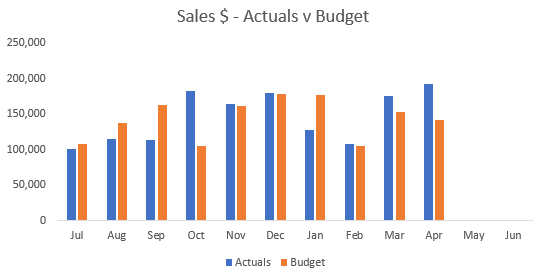
When comparing two metrics over time – such as actuals versus budget – you need to consider the period variance and the year-to-date (YTD) variance. A variance chart plots both the monthly and YTD variances, with a column chart and a line chart. When plotting actuals against budget, it is common to use a standard clustered column chart and display both metrics as columns, as per Figure 1.

The problem with this method is that the variance value must be estimated based on the difference between the two columns displayed. Another problem is that the YTD variance is not shown.
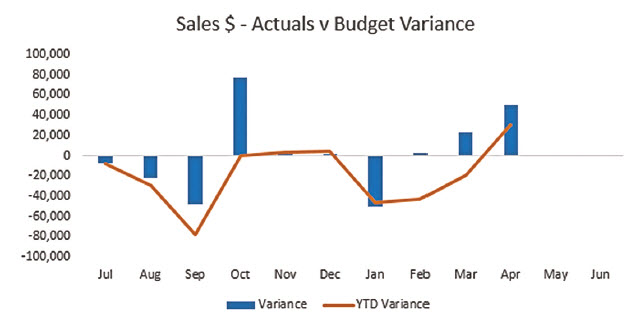
In a variance chart, as shown in Figure 2, the monthly variance value is shown as a column and the YTD variance as a line. You can easily see both the number and the sequence of favourable and unfavourable results, plus the YTD position. Columns above the line are favourable and columns below the line unfavourable.
This chart works well, except when all or most of the variances are the same; that is, either all positive or all negative. If that is the case, the scale on the vertical axis can make the monthly columns smaller and harder to read.

Example
In this example, the comparison metric can be changed to budget, forecast or last year. The data structure we will use is shown in Figure 3.
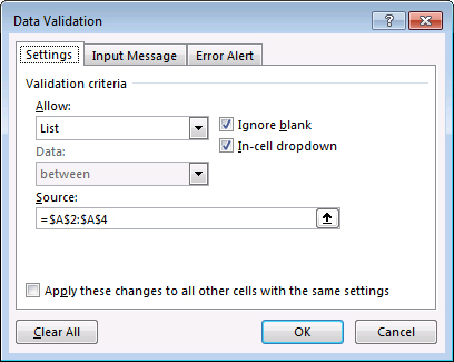
Cell A8 (in yellow) contains a drop-down based on the range A2 to A4. To create an in-cell drop-down, select the cell and press in sequence: Alt A V V (do not hold the keys down). This opens the Data Validation dialog.
Choose List from the Allow drop-down, then click in the Source box, select the range A2:A4 and click OK. See Figure 4.
The formula in cell B8, which has been copied across, is:
=IF(B7={0,""},NA( ),INDEX(B2:B4,MATCH ($A$8,$A$2:$A$4,0)))
This formula demonstrates a few useful techniques.

First, we need to identify when cell B7 is either zero or blank. If that is the case, then we will display the NA error. To identify zero or blank, we could use an OR function but the technique shown above is easier if you are comparing a single cell with multiple values.
Array syntax
The use of the braces (curly brackets) is called array syntax.
B7={0,""}
This instructs Excel to perform multiple logical tests. In this instance, two tests will be performed because there are two elements separated by a comma between the braces. If cell B7 contains either a zero or a blank, then the logical test will return TRUE. Using two quotation marks together is how you refer to a blank cell.
NA error
The NA( ) function returns Excel’s #N/A cell error. The reason you intentionally display an error is that Excel charts do not plot error cells. If there are no sales figures for the month, we don’t want to plot any results.
INDEX function
The INDEX function is one of Excel’s most flexible functions. In this case, it is extracting the correct value from the range above using the MATCH function to identify which entry to extract.
INDEX(B2:B4,MATCH($A$8,$A$2:$A$4,0))
In this example, an INDEX function is easier to create than a VLOOKUP function, which could also have been used.
The INDEX function defines a range B2:B4 that we will extract from. You provide a row number and a column number to extract a cell from within the range. Because we are referring to a single column range, we only need to provide the row number. A row number of one would extract the first cell in the range B2. The row number is provided by the result of the MATCH function. This number will be dependent on the entry in cell A8.
MATCH function

The MATCH function returns a number representing the position of an entry within a range. We will identify where the entry in cell A8 appears in the range A2:A4. The result will be either one, two or three. If cell A8 is empty, an #N/A error will be returned. If cell A8 contains Forecast, then the MATCH would return a two because Forecast is the second entry in the range A2:A4.
The formula in row nine deducts row eight from row seven to calculate the monthly variance.
The formula in cell B10 is shown below:
=SUM($B$9:B9)
This has been copied across. The use of the $ signs at the start of the range fixes that reference, so that it doesn’t change as the formula is copied. This formula calculates the cumulative (YTD) variance for each month.
Variance charts in Excel 2013 and later versions
Creating this chart is simple in Excel 2013 and later versions. Excel 2013 introduced a Recommended Charts feature that suggests chart types based on the data structure selected.
To create the variance chart, first select the range A6:M6. Hold down your Ctrl key and select the range A9:M10 using your mouse. The Ctrl key allows you to select non-adjacent ranges.
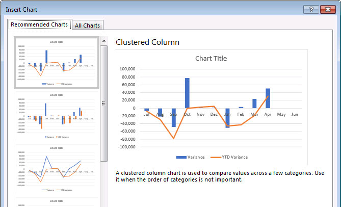
Click the Insert ribbon tab and click Recommended Charts. The variance chart should be the first one highlighted, as shown in Figure 5. Click OK.
Cell A6 has a formula that creates the chart title based on the selection in cell A8. The formula is:
="Sales $ - "&A7&" v "&A8&" Variance"
The & symbol joins text together.

Click on the chart title in the newly created chart, then click in the Formula Bar above the grid and type the = sign, then click on cell A6. This links the chart title to the cell. Changing cell A8 will automatically update the data, as well as the chart title.
Variance charts in older versions of Excel
Select the same range mentioned previously using the Ctrl key. Use the Insert Ribbon tab to create a Clustered Column chart (the first column chart listed). Right-click the YTD column and choose Change Series Chart Type. Choose the first Line chart. You may need to move parts of the chart around, such as the legend. You can link the title as shown above in all versions of Excel.
The companion video and Excel file will go into more detail to demonstrate these techniques.
Neale Blackwood CPA runs A4 Accounting, providing Excel training, webinars and consulting services to organisations around Australia. Questions can be sent to [email protected]

