Excel Tips: Utilise the STOCKHISTORY function

Loading component...
At a glance
In March 2023, I wrote about a new Excel feature called Stock Data Types that allowed you to access share market information dynamically in Excel.
The new STOCKHISTORY function allows formulas to extract historic share price information from different stock exchanges around the world. This function can be used with charts to plot the share price and volume information dynamically.
Using this function generates the same disclaimer as Stock Data Types — see Figure 1.

STOCKHISTORY function
This new function requires the subscription version of Excel and an internet connection. It only requires two arguments to extract stock information. The syntax of the function is shown below. The arguments in square brackets are optional.
Syntax
STOCKHISTORY(stock,start_date,[end_date],[interval],[headers],[property1], [property2],…)
stock — the stock exchange code followed by a colon followed by the stock code, i.e. XASX:CBA is the Australian stock exchange code and the Commonwealth Bank stock code.
Start_date — the date to start displaying the stock information.
End_date — optional — the date to finish the stock information. If omitted, only the start date information is displayed.
Interval — optional — a number that represents the period of the data to return. 0 = Daily, 1 = Weekly and 2 = Monthly. If omitted, daily information is displayed.
Headers — optional — a number used to select the header type. 0 = no headers, 1= column headers and 2 = stock code plus column headers. If omitted, the column headers are displayed.
Property# — optional — there are currently six properties you can extract. You can list all six. 0 = Date, 1 = Closing price, 2 = Opening price, 3 = High price, 4 = Low price and 5 = Volume of sales. If omitted, the Date and Closing price are displayed.
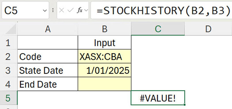
The function displays an error if a single date is selected and that date doesn’t have price information — see Figure 2. 1 January 2025 has been selected and displays an error because the exchange was closed that day and no values were recorded.
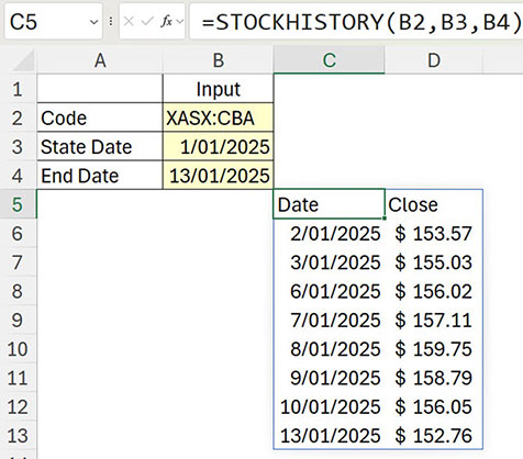
When start and end dates are included, only those dates with values are displayed — see Figure 3.
Note: weekend and public holiday dates are not listed.
The STOCKHISTORY function spills down and across to populate the report range.
Note: spilling has been covered in other articles on dynamic arrays, see part one, part two and part three.
The function’s interval, header and property arguments are all controlled via numbers. This can make it difficult to understand how the function works.
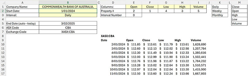
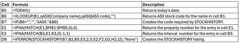
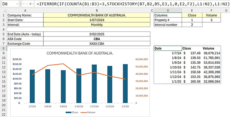
Figure 4 has a structure that simplifies building a report using STOCKHISTORY. The yellow cells are for input.
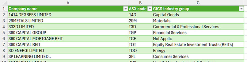
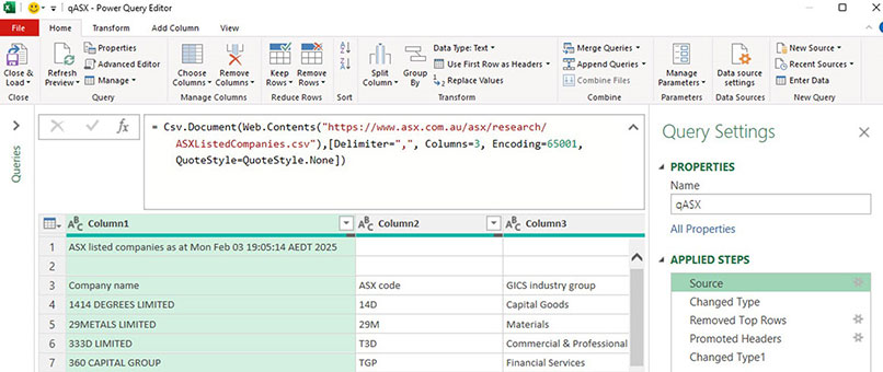
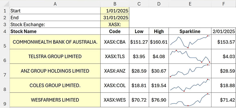
On another sheet, a listing from the ASX website contains Stock names and codes — see Figure 5.
This was downloaded via Power Query direct from the ASX website. The Source step from the Power Query is shown in Figure 6. Refreshing this query will update the list with the latest information.
Cell B1 in Figure 4 contains a drop-down list based on the ASX listing in Figure 5.
Cell B2 in Figure 4 has the start date for the report.
Cell B3 in Figure 4 has a drop-down list for the interval based on the range K1:K3 in Figure 4. This allows the user to select a text description instead of a number for the interval.
The range E1:I1 has drop-downs to allow the user to select up to five separate properties using text descriptions instead of numbers. The drop-down lists are based on the range M1:M5. The selections update the column sequence in the report underneath.
Formulas
The formulas from Figure 4 are shown in Table 1. Note: cell E2 has been copied across to cells F2, G2, H2 and I2.
Formula notes
The MATCH function returns the position number of the item being looked up. In cell E3, one is deducted from the MATCH result because the interval numbering starts at zero.
The STOCKHISTORY function in cell D8 has two entries that are hard-coded.
- The heading argument is 2 — this shows the stock code plus the column headings.
- The first property is the date (0) — this means the listing will always include the date.
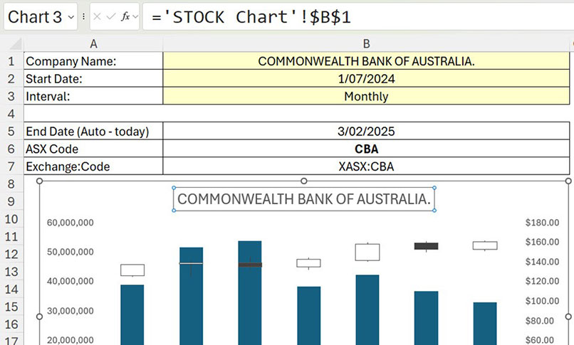
Stock charts
In Figure 7, we have changed the sequence of the columns to match a built-in Excel chart called a Stock chart. In cell D8, the stock code has been omitted, leaving the column headings. The chart in Figure 7 plots all five of the value properties.
Note: The Stock chart works well with the Monthly interval. It is not effective with the weekly or daily intervals.
Understanding the Stock chart
The left-hand axis plots the volumes shown by the blue columns.
The right-hand axis plots the prices. The white boxes represent a price increase in the month from the bottom line (opening price) of the box to the top line (closing price).
The dark grey boxes represent a price decrease in the month from the top line (opening price) of the box to the bottom line (closing price).
The box line, representing the closing price from the previous period, will line up with the opening price line for the box in the next period. This is a similar effect to a waterfall chart.
The thin vertical lines above and below the white and grey boxes represent the distance to the high and low prices from the opening and closing prices for the month.
To create the Stock chart, follow these steps.
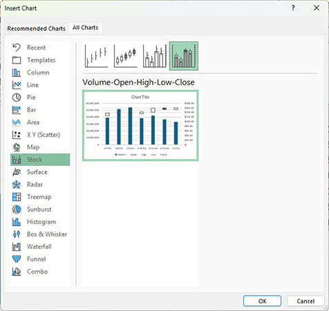
- Select cell D8 and press Ctrl + A to select the spill range.
- Click the Insert ribbon tab. Click the Recommended Charts icon. Click the All Charts tab. Click the Stock option on the left. Click the fourth chart across the top and click OK — see Figure 8.
- Click the chart title. Click in the Formula Bar and press = and use the mouse to click cell B1 and press Enter — see Figure 9.
- Chart complete.
Adjusted formula
The formula in cell D8 in Figure 7 is slightly different to the previous example.
=IFERROR(IF(COUNTA(B1:B3)=3,STOCKHISTORY(B7,B2,B5,E3,1,0,E2,F2,G2,H2,I2),O1:T2),O1:T2)
The IF function handles the situation when an input value in the range B1:B3 is deleted.
The IF and IFERROR functions display another range with values in all the required Stock chart components. This keeps the chart linked to a dynamic range. Without this range the Stock chart may need to be recreated if input entries are deleted.
Closing price and volume chart
Figure 10 shows a closing price and volume chart. This chart handles daily, weekly or monthly intervals. The price (column chart) is on the left axis. The volume (line chart) is on the right axis.
Sparkline charts
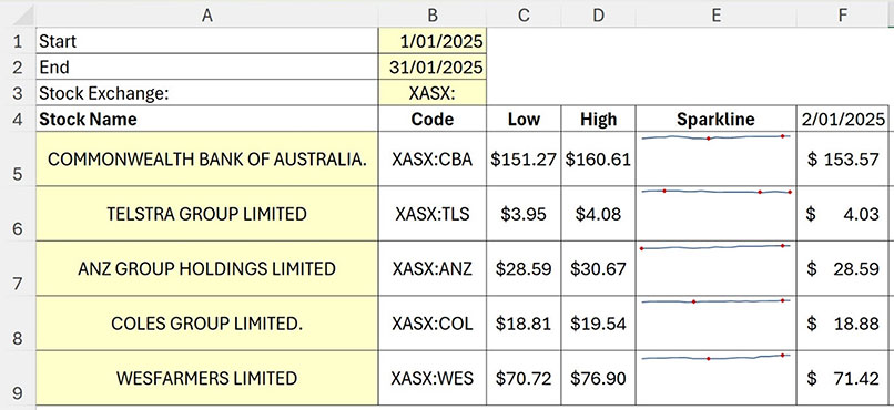
When reviewing multiple stocks, consider using Sparkline charts. In Figure 11, five closing stock prices are plotted using Sparkline charts.
The red dots on the charts represent the high and low values.
Note: the prices appear more volatile than they are. Unfortunately, Sparkline charts do not use zero as the starting value for their vertical axis. As you can see, the Telstra price varied by less than 15 cents, but it looks like it crashed. The companion video at the start of this article will demonstrate how to change the Sparkline charts to a zero vertical axis starting value.
Figure 12 shows that the prices appear less volatile when a zero vertical axis starting value is used.
The STOCKHISTORY function allows you to dynamically analyse stocks and create charts to assist with their analysis.
The companion video and Excel file will go into more detail to demonstrate these techniques.