Loading component...
At a glance
This is part 3 of a 3-part series. See part 1 and part 2 here.
This article shows how to use dynamic array formulas to automate an interactive dashboard. It uses the same data sources as part 2, which looked at automating Month and Year-To-Date (YTD) Excel reports with dynamic arrays.
This interactive dashboard example shows how to select a State and choose between the Budget or Actuals (prior year) as a comparison.
General Ledger
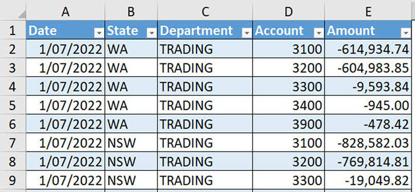
General Ledger (GL) data is shown in a formatted table called tblGLData – see Figure 1. It contains multiple years of data and only includes Profit and Loss accounts. Revenue is shown as negative (credit).
Budget sheet
The Budget sheet has a standard budget layout, as shown in Figure 2. Values are shown as positive.

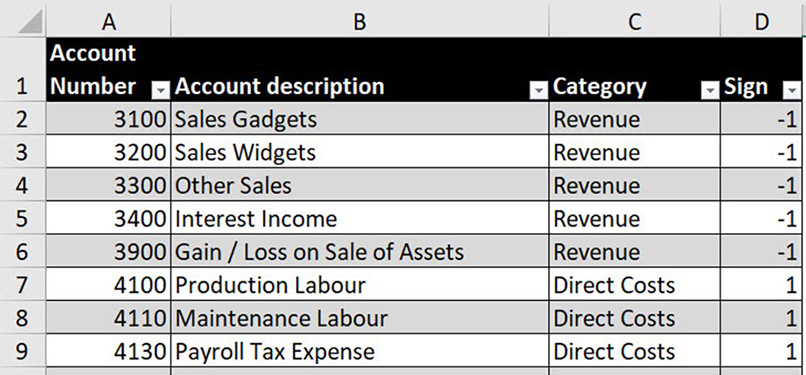
The Accounts table lists all the accounts with their categories and signs – see Figure 3. The Sign column (column D) is used in the reports to convert the negative revenue amounts in the GL dataset to positive values for the dashboard.
How spilling works
Dynamic array formulas can spill down, across or in both directions to create a two-dimensional range. The formula is entered in the top-left cell and will populate the cells below and/or to the right to create a spill range – these cells need to be empty to avoid a #SPILL! error being displayed.
To refer to a spill range, use the top-left cell reference followed by the # symbol, for example:
A1#
The formulas used in this reporting model are discussed in the companion video.
Dashboard sheet
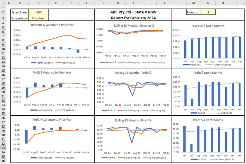
The dashboard is interactive. The user can select the State (see cell C2 in Figure 4) and the comparison dataset (cell C3) to use for variances. The user can also enter the number of months (cell N2) to be displayed in the customised charts on the right.
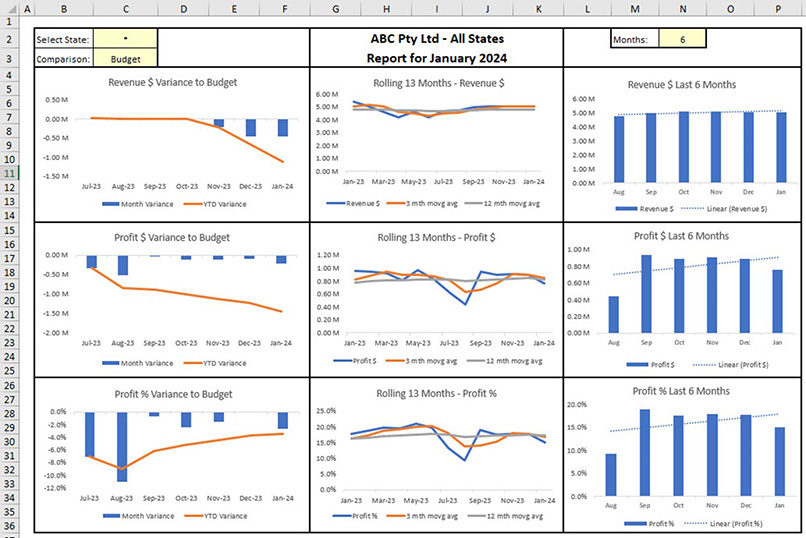
There are three chart types used, as shown in Figure 4:
1. Variance chart (left). This compares actuals against the comparison figure selected by the user in cell C3. If cell C3 is blank, then the budget is used as the comparison.
Each month’s variance is shown as a blue column. A favourable (positive) variance is shown above the axis. An unfavourable (negative) variance is shown below the axis. The YTD variance is shown as an orange line chart. This chart provides the variance and YTD variance position for each month.
2. Line chart (middle). This shows a rolling, 13-month actuals chart, which starts at the same month of previous year (blue line). To remove seasonality, a 3-month moving average (orange line) and a 12-month moving average (grey line) have been included.
3. Column chart (right). This chart shows several months of data, based on the user’s selection in cell N2. The sales are shown as a blue column chart. The blue dotted line is a trend line based on those sales. If cell N2 is blank, then 6 is used as the default value. Cell N2 has a data validation in place to ensure only a whole, positive number is entered.
Workings sheet
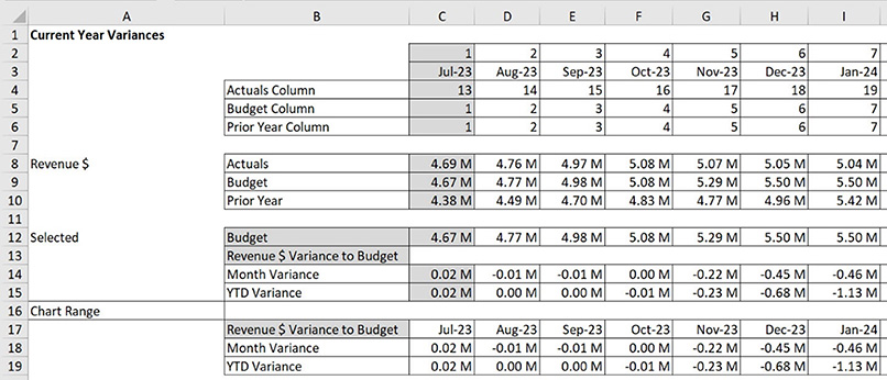
This sheet summarises the GL actuals and budget datasets based on the user’s selections in the Dashboard sheet. The data is summarised by month. Figure 5 shows an extract from the Workings sheet. The grey cells in the Workings and Chart Data sheets contain formulas that are explained in the companion video.

The Actuals section near the top of Figure 5 shows 19 months of results across the sheet. The Budget section at the bottom displays 12 months based on the 2023–24 financial year.
Summarising the monthly data in a Workings sheet simplifies the creation of the final tables used for the dashboard charts.
Chart Data sheet
This sheet creates the tables to be used by the charts on the dashboard. Having a separate sheet for the chart data makes chart creation and maintenance easier.
Chart Data structure
The structure for the current year variance charts for revenue in the Chart Data sheet is shown in Figure 6. The other two dashboard metrics, profit and profit percentage, are listed below revenue and have a similar structure.
Custom number format
This custom number format has been applied to the numbers in the Chart Data sheet:
#,##0.00,, "M"
The two commas after the zeros instruct Excel to round and display the number in millions. A single comma after the zero instructs Excel to round to thousands, two commas round to millions.
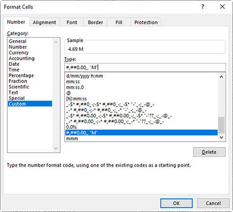
The Format Cells dialog to apply the format is shown in Figure 7. The dashboard charts will use this format in their vertical axes.
Charts and spill ranges
When creating a chart from a spill range, it is vital to select the entire spill range, including labels, before creating the chart. This ensures the chart will expand or contract based on the spill range.
Create a variance chart from a spill range
Follow these steps to create a dynamic variance chart based on a spill range:
1. Select the entire spill range – in this case, the range B16:I18, including the labels.
2. Click Insert in the ribbon. Click the column chart dropdown to choose the top-left chart, which is a clustered column chart.
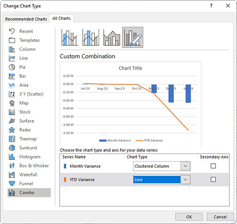
3. Right-click the orange column and choose Change Series Chart Type, change the YTD Variance to a Line chart and click OK – see bottom of Figure 8.
4. Select the chart title, and then click in the Formula Bar. Type = and click cell B17.
5. Select the chart gridlines and press the Delete key.
6. Right-click the horizontal axis and choose Format Axis.
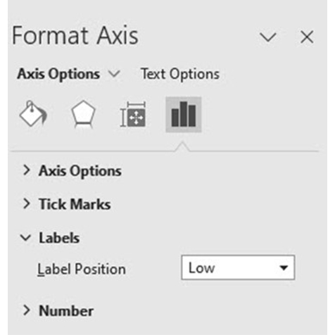
7. Under Axis options, open the Labels section and choose Low for the Label position – see Figure 9.
8. The chart is completed and ready to place on the dashboard.
9. The chart can be copied and pasted on to the dashboard. Using a copy of the chart on the dashboard is a safe practice because if the dashboard version breaks or is accidentally changed the original chart can be re-pasted from the Chart Data sheet.
The other charts are easier to create and will require less adjustment.
Create the rolling 13-month chart
The rolling 13-month charts (middle of the dashboard) use a fixed range. The months displayed will vary as the year progresses, but the same range will be used for the chart.
Figure 10 shows the Chart Data sheet for revenue.

To create the chart.
1. Select the range P7:AC10.
2. Click the Insert ribbon tab and select the Line chart drop down and choose the top left chart.
3. Click the Chart Title and click in the Formula Bar and press = and the click on cell P7.
4. Select the horizontal axis and press Ctrl + 1 for format it.
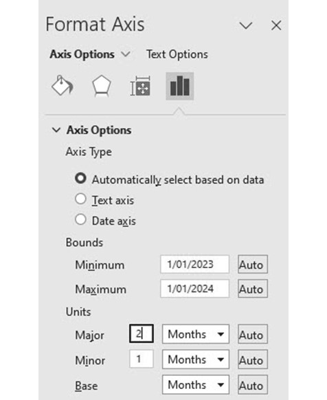
5. Change the Units, Major option to 2 (see Figure 11). This shows every second month on the horizontal axis.
6. Remove the Gridlines and the chart is ready to copy and position on the dashboard.
Last number of months chart
The charts on the right of the dashboard allow the user to select a flexible number of months. The charts include a trendline.
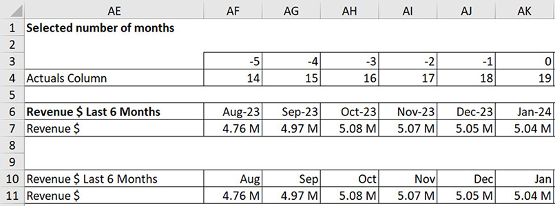
The Chart Data range for the flexible number of months for revenue is shown in Figure 12. Note this is based on an entry of 6 in cell N2 on the Dashboard sheet.
To create the chart:
1. Select the range AE10:AK11.
2. Click the Insert ribbon tab and select the Column chart drop down and choose the top left chart.
3. Click the Chart Title and click in the Formula Bar and press = and the click on cell AE10.
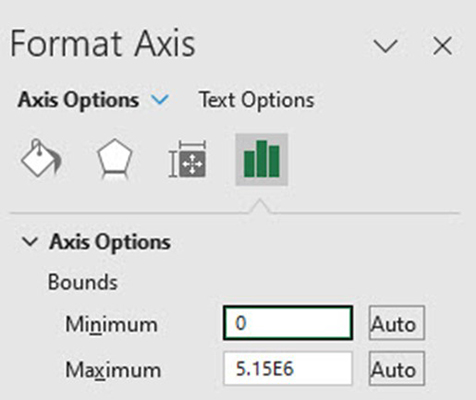
4. The vertical axis may not start at zero. Right the vertical axis and click the Format Axis option. Change the Axis Options Minimum to 0 - see Figure 13.
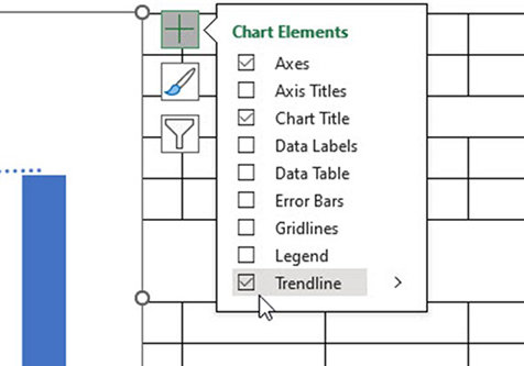
5. Click the green plus sign (top right corner of the chart) and tick the Trendline and Legend options – see Figure 14.
6. The Legend may need to be resized and positioned at the bottom of the chart.
7. Remove the Gridlines and the chart is ready to be copied and positioned on the dashboard.
Automatic update
The dashboard automatically updates when February 2024 figures are added to the GL data sheet. Figure 15 shows the February 2024 dashboard with selection changes.
Companion file and video
The companion Excel file contains the completed sheets including the dashboard. The video explains and demonstrates:
- the formulas used in the Workings and Chart Data sheets
- techniques to position the charts on the dashboard.
- how to change dashboard options
- How to add next month’s data to update the dashboard automatically.

