Excel tips: Interactive Excel charts — part 1


Loading component...
At a glance
Excel’s charts typically have static ranges — while the values may update, the size of the chart is fixed. In this article, learn how to add interaction to charts to make them more flexible, how to let the user control how many months are displayed and give control to the user over what is plotted on the chart.
This first article (part 1) introduces the concept with two examples. Part 2 shows how to extend this even further using check boxes and other functions.
There are several ways to add interaction and flexibility to charts in Excel.
- PivotCharts have interaction built-in and require a PivotTable. Slicers and timelines are used to filter and control the charts.
- Formatted tables allow chart filtering using slicers
- Macros require the use of Visual Basic for Applications (VBA). Provides total control over the process but is more difficult to implement. Many organisations place limitations on the use of Excel macros.
- Formulas — dynamic arrays simplify using formulas to control the source data for a chart.
Prior to dynamic arrays, creating dynamic charts with formulas was a complex process.
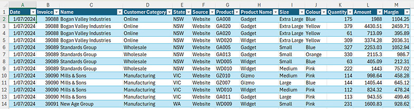
To demonstrate the techniques, a data set with two financial years of sales data is used. Figure 1 shows the data structure. This is a formatted table named tblSales.
Formula-based interactive chart
The solutions combine functions that have been covered in previous articles: dynamic arrays, new Excel functions, SUMIFS function and dates, and GROUPBY and PIVOTBY functions.
The easiest way to create a dynamic chart is to use a single dynamic array formula as the chart data source.
Helper cells and ranges
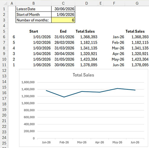
Rather than creating a single mega-formula to create the chart data source, it is more transparent and easier to maintain to use helper cells and ranges with shorter formulas.
Figure 2 has the structure for the example. The yellow cell is for input.
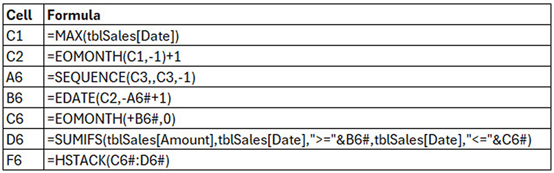
The formulas for the first example are listed in Table 1.
All the formulas in row 6 spill down to match the number of months entered in cell C3. This number determines how many months are displayed on the chart.
Cell C1 returns the last date from the Date column. Cell C2 converts that date to the first day of the month. Cell A6 creates a list of numbers used to build the list of dates in columns B and C.
The EDATE function in B6 adjusts the date using numbers in starting in cell A6.
The EOMONTH function in C6 returns the last day of the month.
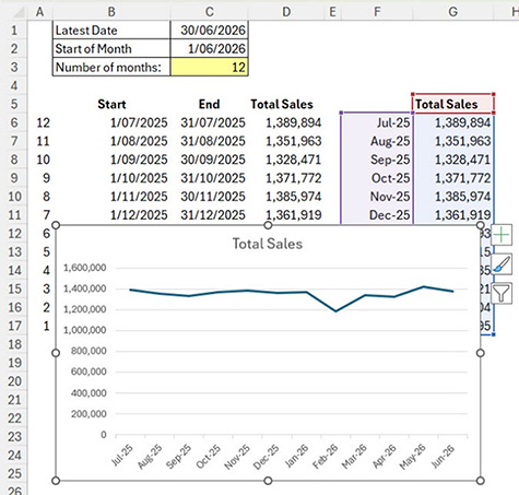
These dates are used to summarise the monthly sales in cell D6 using a SUMIFS function. These are the helper cells and ranges.
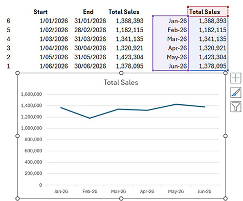
The formula for the chart data source is in cell F6. This spills down and across to summarise the sales by month. Cell F6 uses the HSTACK function to combine the dates and sales values into a single spill range.
Figure 3 shows the chart with the chart data source highlighted.
Changing the number in cell C3 updates the chart — see Figure 4.
GROUPBY function
The previous example created individual spill ranges and used the HSTACK function to combine two of them for the final chart data source.
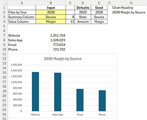
The GROUPBY function creates a report layout that can be used as a chart data source. Figure 5 shows the structure. Yellow cells are for input. Cells B3 and B4 have drop-down lists which are demonstrated and explained in the companion video above.
Column D specifies the default entries if the input cells are blank.
Column E has the entries used in the report based on either the inputs or the defaults. Four of the formulas are listed in Table 2.

The formula in cell E2 uses the default cell if the input cell is blank. Otherwise, the input cell value is used. The formula is copied down.
The formula in cell C3 returns the column number within the tblSales table for the used column. The formula has been copied down.
The formula in cell A8 builds the heading for the chart based on the used entries. The & symbol joins text together.
The GROUPBY function in cell A7 is long. It has several arguments that need to be populated. The output becomes the data source for the chart. The formula is cell A7 is shown below.
=GROUPBY(INDEX(tblSales,,C3),INDEX(tblSales,,C4),SUM,,0,-2,YEAR(tblSales[Date])=E2)
GROUPBY function explained
The first argument defines the column to summarise in the rows of the report. The INDEX function returns the sixth column (Source) from tblSales.
The second argument defines the value column to summarise. The INDEX function returns the 13th column (Margin).
The third argument defines the function to use in the calculation. SUM is commonly used.
The fourth argument is not required and is empty.
The fifth argument is zero, which means “turn off the totals”.
The sixth argument specifies the sort order. Positive numbers sort in ascending order. Negative numbers sort in descending order. The number represents the column number to sort in the output report. Using -2 means sort the second report column in descending order.
The seventh argument is used to filter the output. In this case the YEAR function converts all the dates to their respective calendar year number and then compares that to the year in cell E2. This filters the report to a single calendar year.
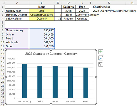
Updating the yellow cells updates the chart — see Figure 6.
Dynamic arrays offer solutions to many difficult charting challenges.
Part 2 modifies the GROUPBY report to handle financial years and allow the user to amend the sorting order. It will all demonstrate how to use the PIVOTBY function to create interactive charts.
The companion video and Excel file go into more detail to demonstrate these techniques.