Loading component...
At a glance
I have covered formatted tables in detail in a previous article. When you use a slicer with a formatted table, you can create an interactive chart.

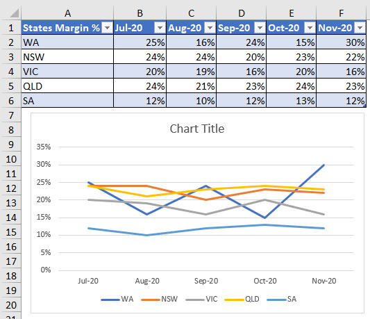
The table we will use is shown in Figure 1.
Plotting all five states on a chart can make it difficult to read (see Figure 2). Adding a slicer makes it easy to pick and choose the states to plot on the chart. This will make comparing them easier.
To convert the table into a formatted table, click a cell in the table and use the keyboard shortcut Ctrl + T.
A dialog box displays, showing the table range to include. If there are no blank columns or blank rows in your data, the range displayed should be correct. Click OK to accept the range. Using the shortcut key to create a formatted table will apply the default table colour.
Note: Blank rows and blank columns in the data can affect Excel’s ability to automatically select the correct range. If you have blank rows or columns, you will need to manually select the range of the table.
Creating an interactive chart
Select a cell in the formatted table, click on the Insert ribbon tab and select a Line chart.

The chart created is probably not the structure that you would have expected. To fix the chart, you need to have the chart selected and clicked in the Design or Chart Design ribbon tab before selecting the Switch Row/Column icon. The chart should now show the months going across the bottom axis as per Figure 2.
It is worthwhile experimenting with the Switch Row/Column icon on all your charts, as it provides another way of viewing the data. As we can see, this has quite a few lines that are all close to each other, making it difficult to read.

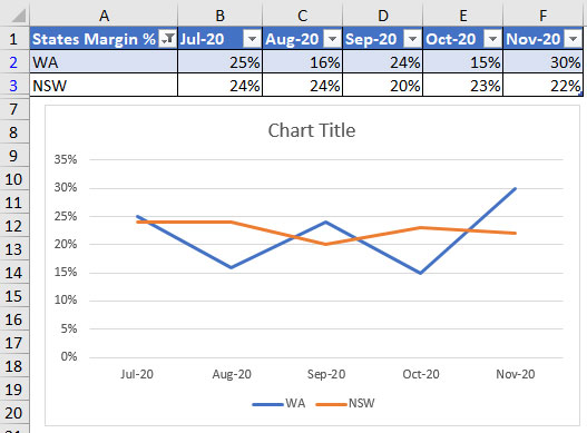
If we filter the formatted table, it will amend the chart. For example, if you use the filter icon in column A to show WA and NSW, then the chart will update accordingly, as per Figure 3.
The default setting for charts is to only plot the visible data. Filtering out rows removes them from the chart.
We can link the Chart Title to cell A1. Click the Chart Title, click in the Formula Bar, press = and click cell A1. It will enter a formula that is related to the formatted table. I will explain this in the companion video, which you can watch by clicking the button on the top of this page.
Excel’s normal filter interface is a bit cumbersome. It is much easier to use a slicer to filter a formatted table.
With a cell selected in the formatted table, click on the Design or Table Design ribbon tab and click on the Insert Slicer icon.
A dialog box will display that enables you to select the column that you want to filter. Select the States Margin % column and click OK.
Selecting a single state on the slicer will display one line on the chart. You can hold the Ctrl key down to select multiple states on the slicer.
There is a small icon with three ticks displayed at top right of the slicer header.
If you click it, you can use the mouse to multi-select items without having to hold the Ctrl key down.
Slicers can be moved anywhere on the sheet. The icon at the top right of the slicer clears the filters. The slicer lists the entries in alphabetic order.
You can rename the slicer. Right-click the slicer and choose Slicer Settings. Change the Caption option to the name that you would like to display on the slicer – I will use State.
The default layout for a slicer is a vertical list. To display it horizontally, you can amend a slicer setting.
Right-click the slicer and choose Size and Properties.

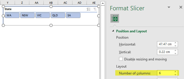
On the right of the screen, a Task Pane opens. Open the Position and Layout option, and update the Number of columns value. You will need to re-size the slicer – see Figure 4. I have used six columns, because I want to show you a useful feature of formatted tables.

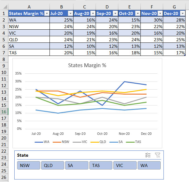
If I add TAS to the table and another row of values, the slicer and chart will both automatically update – see Figure 5.
Formatted tables automatically expand for both rows and columns. This expansion flows through to the chart. In terms of the horizontal slicer, you may need to amend the number of columns as data is added. A vertical slicer automatically expands to handle more options.
The companion video and Excel file will go into more detail to demonstrate these techniques.
Neale Blackwood CPA runs A4 Accounting, providing Excel training, webinars and consulting. Questions can be sent to [email protected]

