Loading component...
At a glance
The first article in this series (Part 1) introduces the concept of interactive charts with two examples. Part 2 shows how to extend this even further using check boxes and other functions to improve interactivity.
This article builds upon the first and assumes that you have read it.
Financial year and flexible sorting
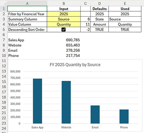
Amending the GROUPBY function to work with financial years and allowing the user to select the sort order requires several changes.
Figure 1 shows the amended structure for financial years with a sort order check box.
Cell B5 (the cell beneath the checkbox) will contain TRUE if the check box is ticked, and FALSE if it is not.
In this case, a ticked check box means descending order. An unticked check box means ascending order. The default entry in column D is TRUE in case the checkbox is accidentally deleted.
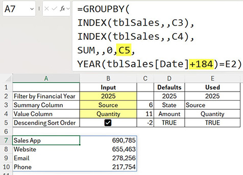
The GROUPBY sort and filter arguments in cell A7 have been amended — see Figure 2.
The sort (6th) argument (highlighted) is now linked to cell C5.
If the check box is ticked, cell C5 returns -2. In the GROUPBY sort argument, this number means sort the second column in descending order.
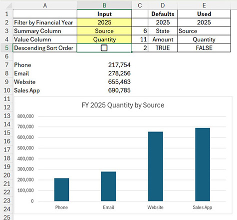
If the checkbox is unticked, cell C5 returns 2. This means sort the second column in ascending order.
In the filter (7th) argument (highlighted), adding 184 to the date converts the calendar year of a date into the July to June financial year. The label in cell A2 has been updated.
Figure 3 shows the unticked result.
PIVOTBY function
The PIVOTBY function can create a report that can be used as a chart data source, like the GROUPBY function. The PIVOTBY function has more arguments than GROUPBY, which can be daunting. Many of the arguments are optional.
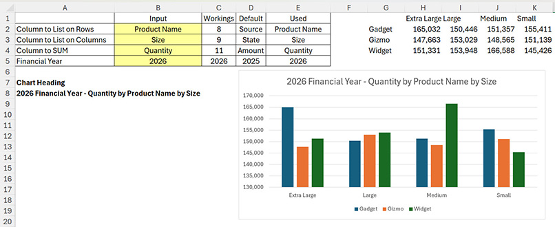
Figure 4 shows the structure for this report.
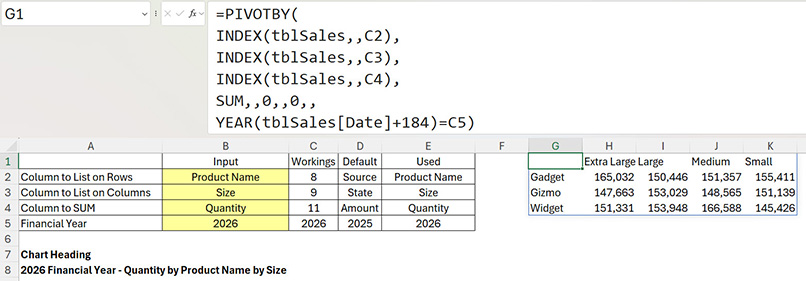
The yellow cells allow the user to select the columns from the sales table to summarise, as well as the financial year to report on. Note: some combinations of row (B2) and column (B3) may not produce a useful chart.
Column E holds the entries used in the chart. The Default (column D) entries are used if the yellow input cells are blank.
The helper cell formulas used are listed in Table 1.
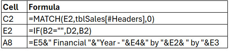
The formula in cell E2 has been copied down. If the input cell is blank, the default entry is used.
The formula in cell C2 has been copied down to cells C3 and C4. It returns the column number in the sales table for the selected column.
The chart heading is created in cell A8 based on the entries in column E.
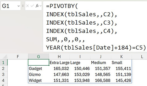
The formula in cell G1 is shown in Figure 5. It is split over multiple lines to review.
In the PIVOTBY function, the first argument is an INDEX function that identifies the column to summarise in the rows of the report.
The second argument is an INDEX function identifying the column to summarise in the columns of the report.
The third argument is an INDEX function identifying the column to perform the summary calculation on. This is usually a value column.
The fourth argument specifies the calculation to perform on the value column, which is the SUM function.
The remaining arguments are all optional. The two arguments with zeros remove the row and column totals. The empty arguments are not required.
The tenth and final argument is a filter based on comparing the financial year to the input year. Only the rows matching the year will be summarised in the report.
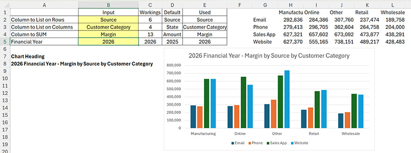
Two examples of selections and charts are shown in Figures 6 and 7.
FILTER function and check boxes
Check boxes can be used to control what is displayed on a chart. In the example below, the FILTER function is used to filter columns, not rows.
This expands on an example from Part 1 — see the updated structure in Figure 8.
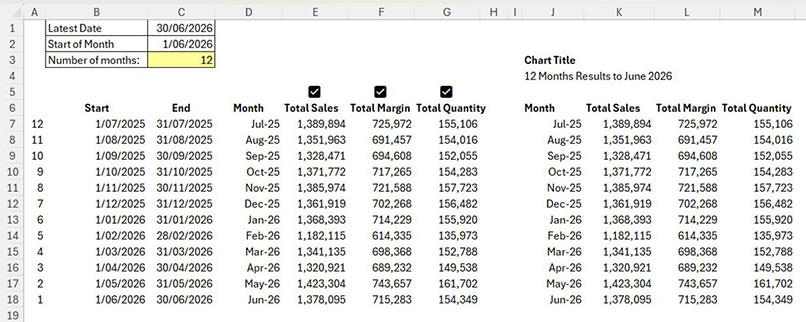
Cell C3 controls the number of months displayed on the chart. Two extra value columns and three check boxes have been added to the structure.
The checkboxes allow the user to easily select the columns to display on the chart. The FILTER function uses the check box range to filter the columns. FILTER can also handle the situation when all three checkboxes are unticked.
The chart source data formula in cell J6 is shown in Figure 9.
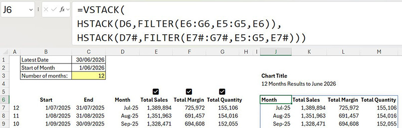
The VSTACK function creates a range by combining the ranges vertically. In data terms, it appends the ranges one above the other.
The HSTACK function combines cells or ranges horizontally creating a multi-column spill range.
The FILTER function filters one range based on a criteria range. In this case, it filters columns to display, not rows.
In this formula, the first HSTACK function creates the heading row for the report. The first argument is the Month heading cell. This will always be displayed. The FILTER function shows the entries in headings row that have a ticked check box above them.
The third argument in the FILTER function is the default entry. In this case, if all the checkboxes were unticked, the Total Sales heading is displayed.
The second HSTACK function creates the data. The Month spill range is always displayed. The first argument in the FILTER function combines the three spill ranges into a single range. The filter criteria is the same as the previous FILTER. The third argument displays the Total Sales spill range if no check boxes are ticked.
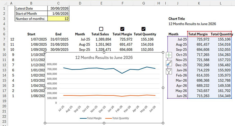
The VSTACK combines the headings and the data into a single spill range to create the chart data source. Figure 10 shows an example.
Structural warning
Deleting or inserting rows or columns above or to the left of the spill ranges can affect the chart. The chart may need to be deleted and re-created. This is demonstrated in the companion video above.
Dynamic charts
Dynamic arrays allow you to add interaction to charts. These techniques could also be applied to other reports.
The companion video and Excel files (blank and complete) go into more detail to demonstrate these techniques.