Loading component...
At a glance
A PivotChart is a chart based on a PivotTable. You must have a PivotTable to have a PivotChart. There is a one-for-one relationship between a PivotChart and a PivotTable. Whatever is displayed on the PivotTable is reflected on the PivotChart. Using a filter on either will affect both.
The advantage of using PivotCharts is the ability to use Slicers and Timelines as filter interfaces.
Worked example
Let’s assume we have a sales transaction dataset and we want to distribute a file to users and allow them to filter by State and Customer Category. The report will have three separate charts. All three charts will have a rolling 12-month view of volume, value and margin.
The dataset columns are shown in Figure 1. This table has been defined using the Format As Table icon on the Home ribbon. I covered formatted tables in my August 2018 article.

We must create three separate PivotTable reports, one each for volume, value and margin. The layout of all three reports will be the same. Once we have created the first PivotTable and PivotChart, we can copy the sheet and adjust it slightly to create the second and third charts.
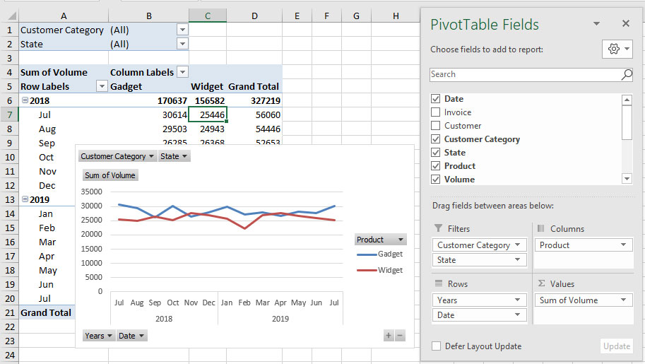
We will start with a volume chart. Click in the table in Figure 1, click the Insert tab and click the PivotTable icon (far left). Click OK and use the mouse to drag and drop the field names from the top section of the PivotTable fields dialog to the four bottom sections as shown in Figure 2. If you are using the latest version of Excel, it will automatically group the dates, and you may need to remove the Quarters field from the rows section.

If you are using an older version of Excel, you will need to group the Dates field by month and year. Right-click one of the dates and choose Group. Hold the Ctrl key down.
Select Year and Month and click OK.
Click inside the report, click the Analyze ribbon tab, then click the PivotChart icon and choose the first line chart and click OK.
If the chart doesn’t look like the one in Figure 2, then right-click the PivotChart and choose Select Data. Click the Switch Row/Column button and click OK.
PivotCharts are different to normal Excel charts. They don’t have the same ribbon tabs and there are limited options to change them.
Note that the PivotTable has subtotals and a grand total, but the line chart ignores them.
There are a number of issues we need to address with the chart.
We want to do a 12-month chart, but there are 13 months displayed because the dataset has 13 months’ worth of data. We need to filter by date and display the last 12 months. A PivotTable won’t let you filter by a field and report on that field. The Timeline filter overcomes this problem. It allows you to filter by a field and report on it. Timelines were added in Excel 2013.
Click inside the PivotTable, click the Analyze tab and click the Insert Timeline icon. Tick the Date field and click OK. Note that timelines only filter dates, so only the date field was displayed. Excel examines the entries in all the fields to determine which ones contain dates.
The Timeline floats above grid and can moved and resized. Use the slider at the bottom to select the August 2018 month. Point to the right-hand edge of the month selected and drag the double headed arrow to the right to include all the months up to and including July 2019.
The default layout of the PivotChart in Figure 2 includes the field filter drop-downs. These take up space and are distracting. If you leave them on the chart, the user will be able to amend all the filters for that chart. For our purposes, we want to remove them to maximise the chart area. Right-click any of the filter buttons and choose Hide All Field Buttons on the chart. We will use a Slicer to allow the user to filter by State and/or Customer Category.
That cleans up the chart, but we need a chart title. With the chart selected, click the plus sign that appears at the top right corner. Tick the Chart Title option. With Chart Title still selected, click in the Formula Bar and press the = sign and click cell A4 and press Enter. That links the title to the cell. Sum of Volume isn’t the best heading. If you try changing cell A4 to Volume, Excel will display an error message. The trick is to type Volume followed by a space. Excel will accept that. Rename the sheet as Volume. You can also change the name of the PivotTable. With the PivotTable selected, click on the Analyze tab. On the far left you can change the name. I will change it to Volume. Naming the PivotTable is useful if you are using a lot of them.
To create the other two charts, we can copy the sheet and change a few settings. The easiest way to copy a sheet is to drag the sheet tab with the mouse while holding down the Ctrl key.
Rename the sheet as Value. In the Timeline filter, click the icon in the top right corner. This clears the filter. Then delete the Timeline – we will use the Timeline on the Volume sheet to control this report. In the PivotTable fields dialog, drag the Value field to the Value section and drag the Volume field up to the top field list section. This removes Volume from the PivotTable. Rename the PivotTable as Value. Change cell A4 to Value with a space.

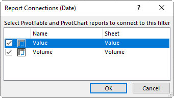
Return to the Volume sheet and right-click the Timeline filter. Choose Report Connections, tick the Value sheet PivotTable and click OK – see Figure 3.
The single Timeline on the Volume sheet is now filtering both PivotTable reports and charts.
Copy the Value sheet and rename it as Margin. In the PivotTable fields dialog, in the Value section, remove Value and add Margin. Change the PivotTable name to Margin and cell A4 to Margin with a space.
This new margin report and chart will also be filtered by the Timeline from the Volume sheet.
As the year progresses, each time a new month’s data is added to the dataset, we will need to update this Timeline filter to filter the current 12-month period. All three reports and charts will automatically be updated.
On the Volume sheet, click inside the PivotTable. Click the Analyze tab and click Insert Slicer. Tick the State and Customer Category options and click OK.
Right-click each Slicer and choose Report Connections. Make sure all three reports are ticked and click OK.
Insert a blank sheet (Shift + F11 inserts a blank sheet).
Copy each chart in turn from the Volume, Value and Margin sheets and paste it in the blank sheet. Rename the blank sheet Charts.
Right-click each Slicer (State and Customer Category) from the Volume sheet and cut-and-paste it in the Charts sheet.
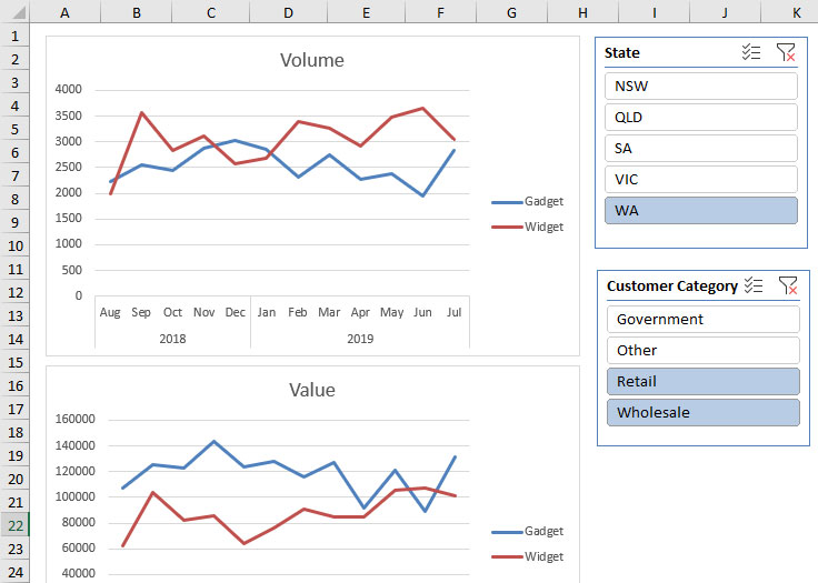
An extract from the final Charts sheet is shown in Figure 4. This is filtered by WA, as well as the Retail and Wholesale customer categories.

The monthly report process will be:
- Paste the latest data into the Sales Data sheet.
- In the Volume sheet, click inside the report and press Alt + F5. This is the shortcut for Refresh All and it will update the other PivotTables as well.
- Adjust the Timeline in the Volume sheet to the latest 12-month period.
Formatting a pivotchart
To format any part of the PivotChart, click on the part of the chart and press Ctrl + 1. Always use the 1 on the keyboard, not the 1 on the numeric keypad. This shortcut can be used to format anything in Excel.
If you change the number format in the PivotTable, the format will flow through to the PivotChart.
The companion video and Excel files (blank & complete) will go into more detail to demonstrate these techniques.
Neale Blackwood CPA runs A4 Accounting, providing Excel training, webinars and consulting services to organisations around Australia. Questions can be sent to [email protected]

