Loading component...
At a glance
Excel doesn’t have a built-in timeline chart, but you can use a scatter chart with error bars to build one.
Worked example
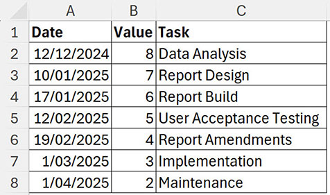
The data for the demonstration is shown in Figure 1.
The Value column number determines the position of the Task label on the chart. Once built you can change the Value number to vary the Task label position. You can adjust the number to stop labels overlapping.
Selecting chart items
When selecting a data series on a chart you can click a single data point once to select the whole series. Any formats are then applied to the whole series. If you double click a data point you will only select that data point and any formats will only be applied to the single data point and not the whole series.
Be careful when following the instructions below and only click once on the data point and other parts of the chart when instructed.
Steps
1. Select the range A1:B8.
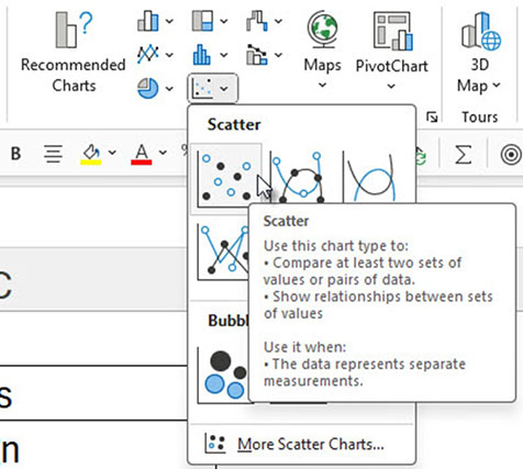
2. Click the Insert ribbon tab. Click the drop down for Scatter charts and choose the top left scatter chart – see Figure 2.
3. Select the vertical (left) axis on the chart. This axis is not required. Press the Delete key to delete the axis.
4. Click the green plus sign (top right of chart) and untick Gridlines and tick Error Bars and Data Labels – see Figure 3.
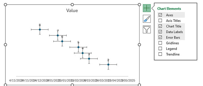
5. The vertical error bars will be used to attach each data point to the horizontal axis. The horizontal error bars are not required.
6. Click one of the horizontal error bars. Figure 4 shows all the horizonal error bars have been selected.
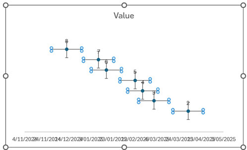
Press the Delete key to delete all the horizontal error bars.
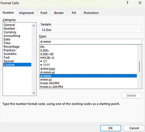
7. The horizontal axis is difficult to read because it is using the same date format as the source data. Changing the date format on the sheet will update the chart axis format. Change the date format in the range A2:A8 to a custom number format d-mmm – see Figure 5.
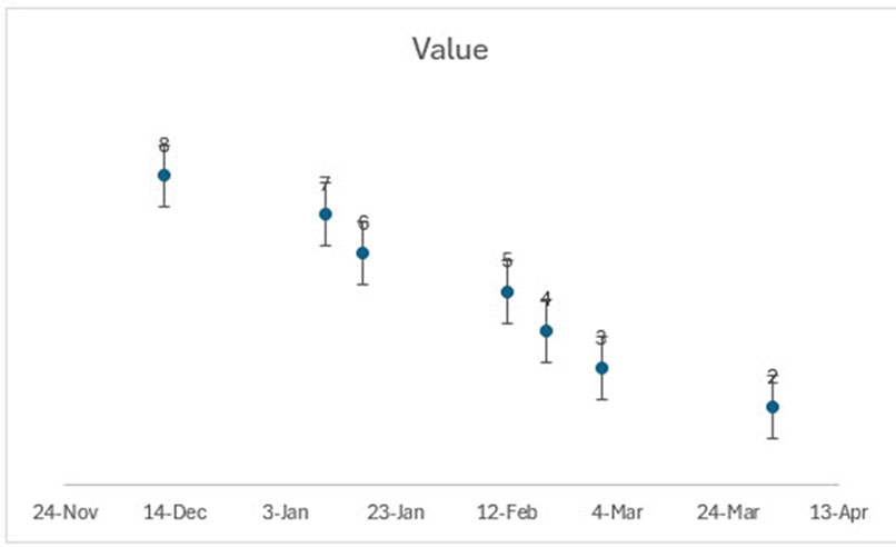
This format makes the chart axis easier to read – see Figure 6.
8. Click one of the vertical error bars. Press Ctrl + 1 to format them.
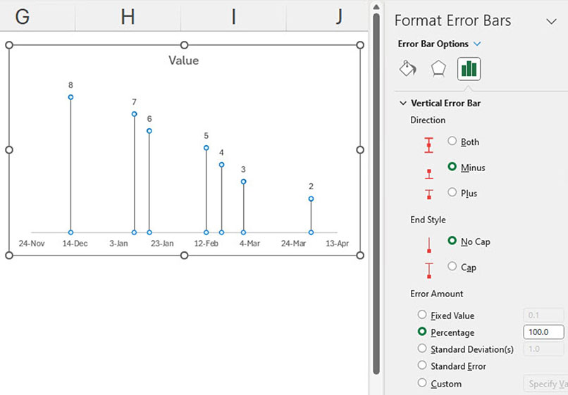
9. In the Task Pane that opens on the right of screen select the Minus option in the Direction section. Select the No Cap option in the End Style section. Select the Percentage option in the Error Amount section and enter 100 in the box and press Enter – see Figure 7 for the settings and the updated chart.
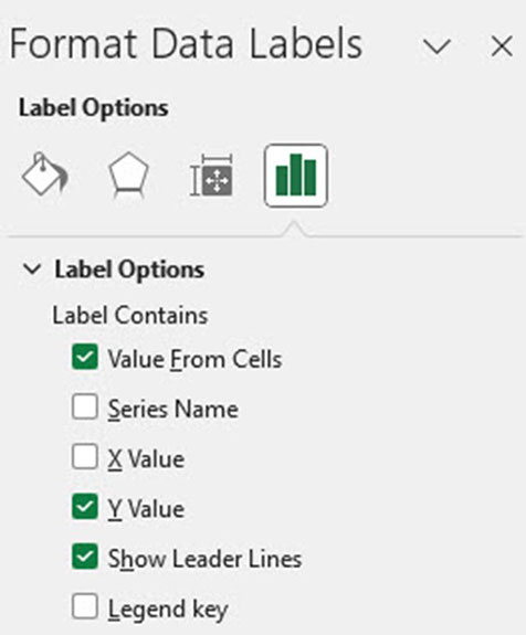
10. Click one of the Data labels (the small number above the data point). In the Task Pane on the right of screen click the last icon (small green column chart icon) at the top and open the Label options. Tick the Value From Cells option – see Figure 8.
11. A dialog box will open. Select the range C2:C8 and click OK. See Figure 9.
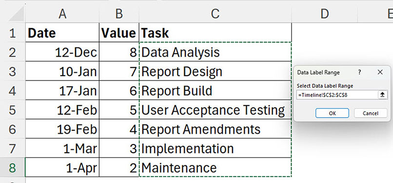
This adds the Task name to the data label. You can use this technique to add customised labels to a chart.
12. In the Task Pane on the right of screen untick the Y Value and Show leader lines options. In the Label Position section select the Right option. The completed chart and Label Options settings are shown in Figure 10.
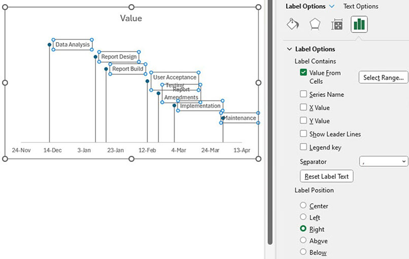
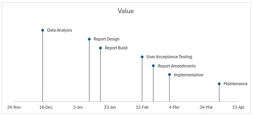
13. Notice some of the data labels are split over two lines. This is because all the labels have the same width. Making the chart wider will expand the data label width. See Figure 11.
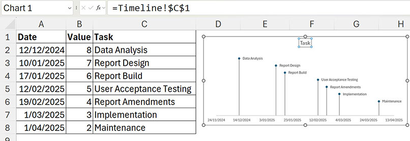
14. Click the chart title which displays Value. Click in the Formula Bar. Type = and use the mouse to select cell C1. This links the chart title to the cell. Changing cell C1will update the chart title – see Figure 12.
15. Changing the values in column B will instantly adjust how high or low the labels appear on the timeline. Negative numbers will appear below the axis.
Figure 13 shows an example of the tasks split between above and below the timeline.

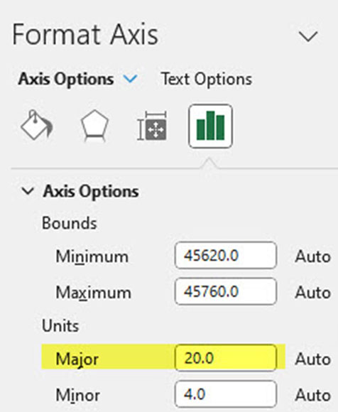
The horizontal axis has defaulted to a 20-day gap between dates displayed – see the Units – Major in Figure 14.
Consider changing this number depending on your time scale.
Dates
You may have noticed the unusual numbers in the Minimum and Maximum boxes in Figure 14. These numbers represent the underlying number for the chart start date 14 November 2024 (45620.0) and the chart end date 13 April 2025 (45760.0). Excel automatically entered these numbers. You can edit these numbers to change the chart start and end dates.
Excel dates started on 1 January 1900. That was day 1. Each day since has been allocated a sequential number.
To see the underlying number for a date, select the date and press in sequence Alt H E F without holding the keys down. This keyboard shortcut removes all formats and shows the date’s underlying number. You can use Undo to reset the date. You can use this technique to find the underlying number for a specific date to use in the Minimum and Maximum entries.
The companion video and Excel file will go into more detail to demonstrate these techniques.

