Loading component...
At a glance
Excel, data and AI
There has been much media coverage of ChatGPT, the AI website that can apparently answer questions plus write poetry and songs.
Excel has its own built-in AI feature, which is data focused and can quickly provide many insights into your data.
It can also create PivotTables and PivotCharts at the click of a button. This can be useful for both analysis and audit work.
Data warning
This feature uses an external AI provider and requires an internet connection. This means your data is being looked at by a third party and not necessarily Microsoft.
After reading the Microsoft Privacy Policy for AI, I was still not completely clear on how the data was used. Given that this is a new concept, err on the side of caution and do not share any sensitive data with this feature.
Analysing data
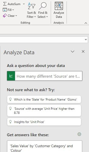
The “Analyze Data” icon is on the far right-hand side of the Home ribbon. It opens a task pane on the right-hand side of the screen, which can be made wider. See Figure 1.
The feature works best with formatted tables. To convert a standard table into a formatted table:
- Select a cell in the table.
- Press CTRL + T.
- Confirm the headers and the range.
- Click OK.
Worked example
I have a sales data table that is about 6000 rows long, as shown in Figure 2.

The table is a formatted table. This is randomised data, so the insights are basic.
Click anywhere inside your data table and click the Analyze Data icon.
The data is analysed, and some general observations are made. Suggested questions are also provided to give you an idea of the types of questions to ask, as in Figure 1.
Exclude any unnecessary columns to focus the analysis on the important columns. There is a small cog icon on the right of the text, “Get answers like these:”.
- Click the cog icon and the columns will be listed.
- Untick any unwanted columns to ignore them. This omits them from the analysis.
- Click Update.
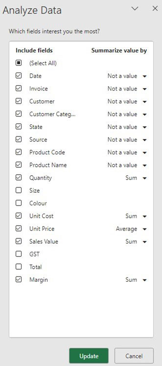
As shown in Figure 3, I have excluded Size, Colour and GST and Total.
The current options for the “Summarise value by” selection on the right are Sum and Average.
This may cause a revised analysis with different observations and questions.
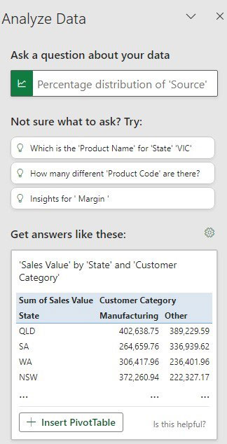
The amended Task Pane is shown in Figure 4.
The Insert PivotTable button inserts a new sheet called Suggestion1 with the PivotTable shown in Figure 5. For those who have never used PivotTables, this is a good demonstration of their versatility.

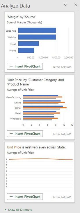
Scroll down the task pane to see further reports. In this case, it has PivotCharts as shown in Figure 6. Note that the last chart has an observation about the Unit Price.
Clicking the Insert PivotChart button will insert a new sheet with a PivotTable and its associated PivotChart.
However, the comment about the unit price may not be accurate. The unit price is a field in the data. You can see in Figure 3 that it has averaged the column. The AI has done a standard average, not a weighted average, which may not be the best calculation in this case.
This demonstrates that common sense and critical thinking are still needed when reviewing this feature’s output.
More results can be seen by clicking the message at the bottom of the task pane in Figure 6.
Asking questions
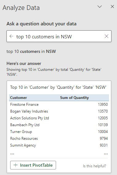
The query typed may be more of a request than a question, but questions can be entered. Figure 7 and Figure 8 show the results of two requests.
In both cases, the feature used the Quantity column to measure the top items.
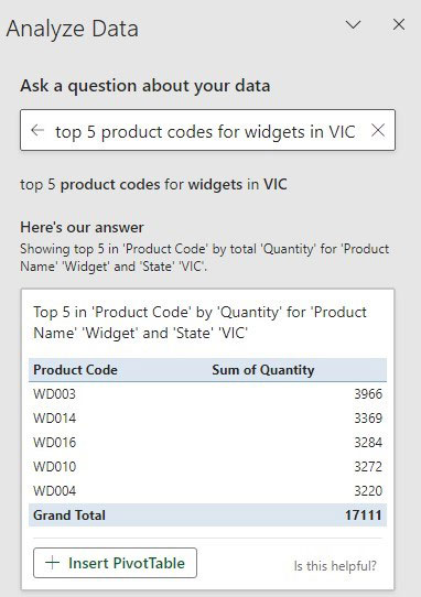
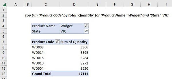
Clicking the insert PivotTable button on Figure 8 created the report in Figure 9 in a new sheet.
The results show that Excel converted the words “top 5 product codes for widgets in VIC” into a PivotTable with two column filters plus a top five value filter.
My request mentions the Product Code column, but not the Product Name or State columns, only the entries they contain.
The heading in cell B2 in Figure 9 will not update just by changing the filters in cells D4 and D5. Creating a formula in cell B2 would allow it to be more dynamic.
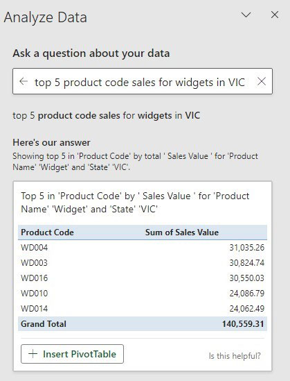
Sales values tend to be used to measure the top sales. Adding a single word fixes the request – see Figure 10.
Insights
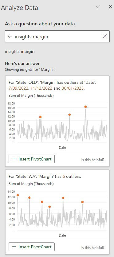
Using the term “insights” followed by a column name can often display outliers for that column. This can be useful for initial data analysis and for auditing purposes. See Figure 11.
Invoices
Each row in the sales data table is a sales line in an invoice. Most invoices have multiple rows.
When checking if the feature understood the relationship of multiple lines for an invoice number, my first question, “What is the highest value invoice in NSW?” returned the wrong answer.
It displayed the highest invoice number for NSW. This was my fault. Value can mean many things. The invoice number itself is a value.
My changed question “What invoice has the highest sales value in NSW” returned the correct result. Another change, “What customer had the highest sales value invoice in NSW?” also returned the correct result.
Over time
To see results using the dates in your data, use the term “over time”. For example, monthly sales values of gizmos in VIC. Without including the term “monthly”, it will show daily sales. It also recognises the term “quarterly”.
Single tables
Excel can report on multiple tables using PivotTables when there are related tables using the Data Model, much like a relational database. Currently, the Analyze Data feature only works on single tables.
There is a similar question feature in Power BI that does work with fields (columns) in related tables, like a relational database. It also includes a voice recognition version.
When using Analyze Data for the first time, changing some of the column names will make it easier to ask questions and get the desired results.
Multiple task panes
Many features now use a dedicated task pane on the right of the screen. Excel adds icons to the far right of the screen to allow selection between the different task panes if more than one is active.

