Loading component...
At a glance
The techniques used in this example can be applied to other charting and reporting requirements.
Worked example
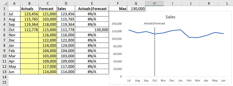
The chart we will create is shown in Figure 1.
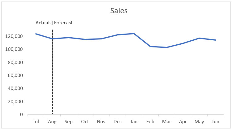
The dotted vertical line automatically moves to the right whenever new actuals are added to column B in the data table shown in Figure 2.
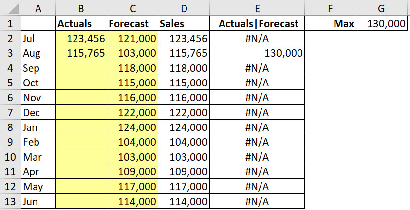
Columns B and C are input columns. The formula in cell D2, which we’ve copied down, is
=IF(B2=0,C2,B2)
This formula displays the amount from column C if there is a zero (or blank cell) in column B. If there is an amount in column B, it will it display in column D. This creates the revised sales forecast for the year.
To position the vertical line and make sure it is long enough, we need to estimate an amount greater than the maximum amount in the sales in column D. That’s what the formula in cell G1 does, and it is shown below.
=ROUNDUP(MAX($D$2:$D$13),-4)
The MAX function returns the maximum value from the Sales in column D. To make sure we exceed that amount, we’ve used the ROUNDUP function with a negative number as the second argument.
Using a negative number as the second argument rounds to the left of the decimal point. By using -4, we’re rounding up to the nearest 10,000. In this case that equals 130,000.
Using -3 would round up to the nearest 1000. Column E is used to create the dotted line for our chart. As you can see, there are 11 #N/A errors and a single value.
These errors are displayed on purpose because Excel won’t plot #N/A values on the chart. You may be surprised to discover that there is an Excel function to display the #N/A error.
The formula in cell E2, which we’ve copied down, is
=IF(AND(B2>0,B3=0),$G$1,NA())
This formula reviews the current row in column B as well as the next row in column B.
If the current row is greater than zero and the next row is zero, then the maximum value we calculated in cell G1 is displayed. Otherwise, the NA function returns the #N/A error. This results in the maximum value being displayed on the same row as the last actuals figure.
The vertical line between Actuals and Forecast in cell E1 is achieved by using what is called the “pipe” character. This is on the same key as \ and you need to hold down the Shift key to select it.
With this structure we can create the chart.
Chart instructions
1. Select the range A1:A13.
2. Hold the Ctrl key down and select the range D1:E13.
3. Click the Insert ribbon tab. In the Charts section (middle of tab), select the dropdown for line charts and select the top left line chart.
4. With the chart still selected, press Ctrl + 1. Press the 1 on the top left of the keyboard, not the numeric keypad. This opens the Chart Format task pane on the right of the screen. This shortcut works throughout Excel and opens the format dialog for whatever is selected.
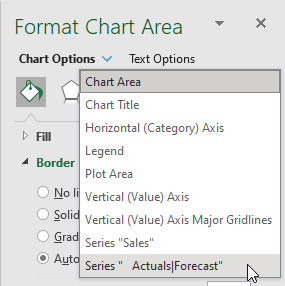
5. In the top left of the task pane, click the dropdown and choose Series Actuals|Forecast – bottom of list. See Figure 3.
6. A single data point should appear on the chart. This is the 130,000 data point in August.
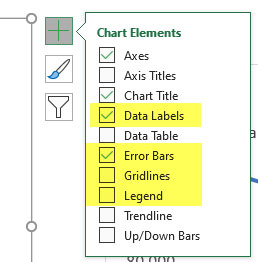
7. Click the Chart Elements green plus sign in the top right of the chart, tick Data Labels and Error Bars and untick Gridlines and Legend. See settings in Figure 4.
8. In the task pane on the right of the screen, click the top left drop-down as per step 5 and select the Series Actuals|Forecast Data Labels.
9. In the task pane click the last icon (it looks like a column chart). Under Label Options, select Series Name and untick the Value.
10. In the task pane click the top left dropdown (as per steps 5 and 8) and select the Series Actuals|Forecast Error Bars – bottom of list.
11. In the task pane click the last icon (it looks like a column chart) and change Direction to Minus and the End Style to No Cap. In the Error Amount section, select Percentage and enter 100%.
12. Click the first icon (the paint can) and change the Width to 1.5 pt. Change the Dash Type to a dotted line.
13. Click on the Chart Title, click in the Formula Bar, press = and click on cell D1 then press Enter. This links to the Chart Title to cell D1.
As the year progresses the dotted line will move across the chart – see Figure 5.
Error bars offer solutions to common chart problems.
Selecting a single point on a chart can be challenging. Using the drop-down in the task pane to select a data series is easier.
The companion video and Excel file will go into more detail to demonstrate these techniques.
Neale Blackwood CPA runs A4 Accounting, providing Excel training, webinars and consulting services. Questions can be sent to [email protected]

