Loading component...
At a glance
QUESTION
Excel’s Sparkline charts have an option to plot the High and Low values. Can this be done with a normal Excel chart?
ANSWER
Sparkline charts are small charts that fit inside a cell (I covered this topic in the February 2014 issue of INTHEBLACK). Excel’s normal charts don’t have a High-Low option, but it is possible to recreate the High-Low effect with a couple of charting tricks.
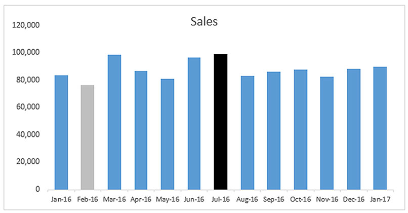
This is a rolling 13-month sales chart.

I have used black for the high point and grey for the low point. The choice of colours is up to you. Bear in mind that colour blindness affects about 8 per cent of men (but only 0.4 per cent of women) within certain populations. The typical traffic light colours (red, yellow and green) can therefore present problems for some readers, but blue is a reasonably safe colour for this chart.

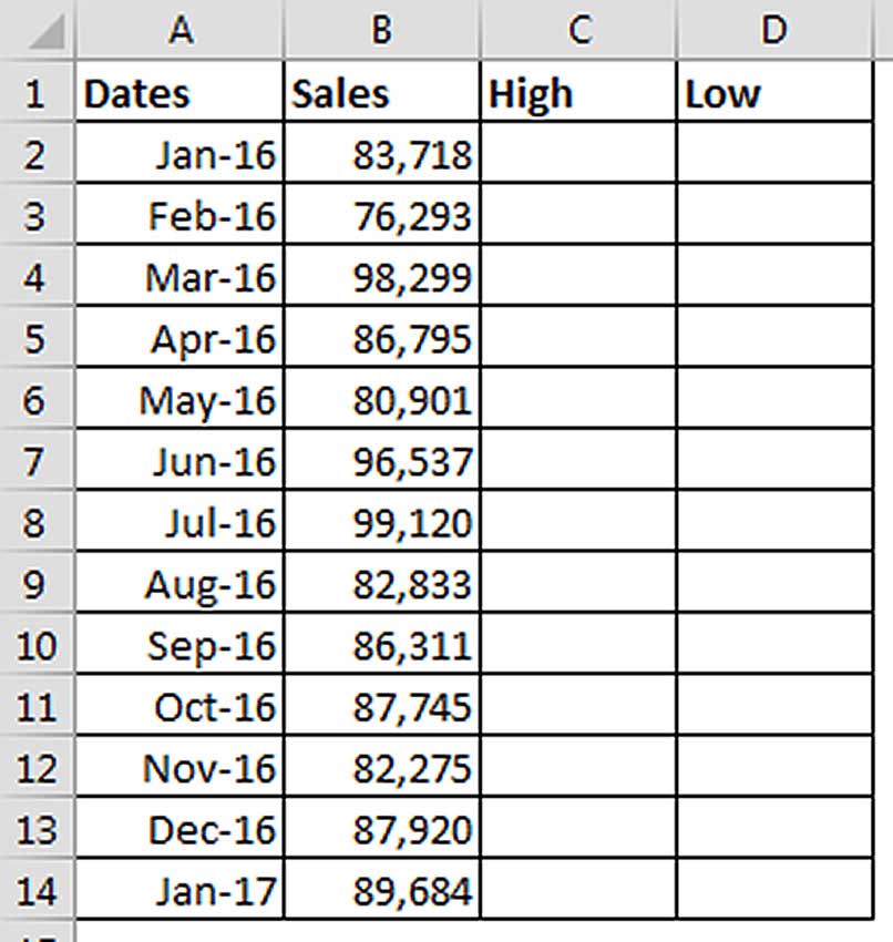
We need to create a special table structure and take advantage of the way charts handle errors to achieve the above chart. The table we will use is shown in Figure 2.
To plot the high and low values, we will use formulas to create two separate data series in columns C and D.
We need separate formulas for the high and low values. The formula for cell C2 is:
=IF(MAX($B$2:$B$14)=B2,B2,NA())
This formula can be copied down the column. The formula uses the MAX function to identify the highest value in the range $B$2:$B$14. It then compares that maximum value to the current row’s value.

If the current row’s value matches the highest value in the range, then that row’s value is displayed.
If the current row’s value is not the highest value, then the function NA() is used.
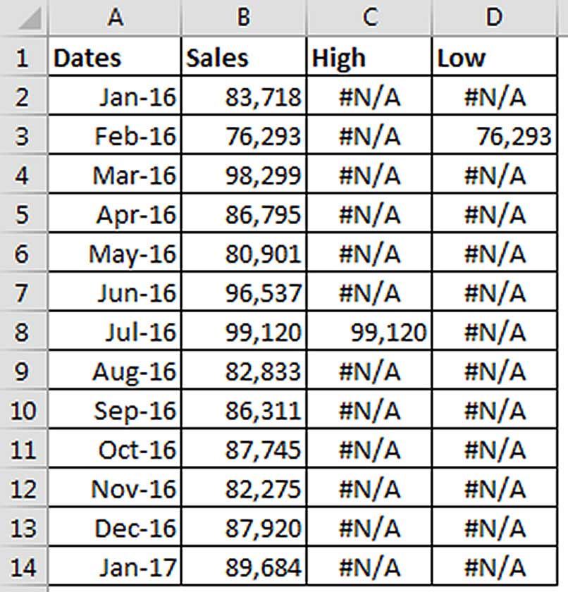
The NA() function is unusual because it displays the #N/A error. You would be justified in asking “why would you purposely display an error?”. The answer is that charts don’t plot error values, which in our case is exactly what we want. We only want to display the highest value in column C. All other values should be ignored and the errors enable that.
Note: if there are multiple highest values, then each highest value will be displayed in the chart. If you only want to display the first or last highest/lowest value, there are alternate formulas at the end of this article.

The formula for cell D2 is similar, but it uses the MIN function to find the lowest value and is shown below.
=IF(MIN($B$2:$B$14)=B2,B2,NA())
Our table is now ready to create the chart and is shown in Figure 3.
The steps to create the High-Low chart are:
- Select the range A1:D14. Click the Insert ribbon tab and use the icons in the Chart section to create a Clustered Column chart. It is the first chart in the Column chart category.
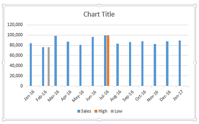
- You should see something similar to the image in Figure 4.
- Right-click any column in the chart and choose Format Data Series.
- You need to change the Series Overlap to 100 per cent to create the effect we are after. You can also change the Gap Width to 100 per cent to make the columns wider.
- Add a Chart Title to the chart and then click in the Formula Bar (above the spreadsheet grid) and type the = sign and click cell B1 and press Enter. That links the title to the cell B1 – see Figure 5.
- You can right-click the low and high columns on the chart in turn and select a colour from the Fill icon that appears.
- Consider deleting the gridlines on the chart. I avoid gridlines as they add “visual noise” to a chart and, in my opinion, they don’t improve the chart’s readability. Simply select the gridlines and use the Delete key on the keyboard. You may also want to delete the Legend at the bottom of the chart. The final chart should closely match Figure 1.

Other applications
This technique could be applied to charts where you want the colours of the columns to vary automatically, based on specific rules. You could change the colours based on conditions, like conditional formatting for column charts.
Alternate formulas
If there are duplicate values in the range and you only want to display the first or last highest and the first or last lowest values, the following formulas provide a solution. The formulas can be copied down. In all cases, the only difference between the C2 and D2 formulas is the use of MAX or MIN functions.
First Highest Only (cell C2)
=IF(AND(MAX($B$2:$B$14)=B2,COUNTIF($B$2:B2,B2)=1),B2,NA())
First Lowest Value Only (cell D2)
=IF(AND(MIN($B$2:$B$14)=B2,COUNTIF($B$2:B2,B2)=1),B2,NA())
The COUNTIF function counts the number of values that match criteria. I have used an expanding range in the COUNTIF function ($B$2:B2). This range grows as the formula is copied down the column. By comparing the COUNTIF result to 1, we identify the first time the value appears in the range.
The AND function ensures that multiple criteria have been met – in the cases above, that the value is the highest/lowest value and it is the first time the value has appeared in the range.
The formulas for the last highest and last lowest values are more complex and expand on the previous formulas.
Last Highest Value Only (cell C2)
=IF(AND(MAX($B$2:$B$14)=B2,COUNTIF($B$2:B2,B2)=
COUNTIF($B$2:$B$14,B2)),B2,NA())
Last Lowest Value Only (cell D2)
=IF(AND(MIN($B$2:$B$14)=B2,COUNTIF($B$2:B2,B2)=
COUNTIF($B$2:$B$14,B2)),B2,NA())>
Instead of comparing the COUNTIF result to 1, I have used another COUNTIF to identify how many times the value appears in the whole range. Hence, we can identify the last value in the range that matches the current row’s amount and is the highest or lowest value.
The companion video and an Excel file may assist your understanding.
Neale Blackwood CPA runs A4 Accounting, providing Excel training, webinars and consulting services to organisations around Australia. Questions can be sent to [email protected]

