Loading component...
At a glance
This is part 3 of a 3-part series. See part 1 and part 2 here.
Python is a popular modern programming language. A recent upgrade to Excel has now made it possible to use Python code inside an Excel cell.
This is the third in a three-part series on Python in Excel:
- Part 1: The basics
- Part 2: Starting to code
- Part 3: Application in Excel
This article assumes you have read part 1 and part 2. It builds upon the techniques from the previous articles and demonstrates more features of the Pandas library.
It includes information about Python’s data-handling and charting capabilities, and its data-cleansing features. Python in Excel does have some quota limitations you need to be aware of.
Interacting with Power Query
Power Query has been discussed in many Excel Tips articles and is the best-practice method to import data into Excel.
Power Query can import data as a “Connection only”. In some cases, this can reduce file size. This means the data is held in the computer’s memory but is not visible on a sheet. You can access the data via a PivotTable. You cannot access a connection only query via Excel formulas and functions.
Python allows you to access a connection only query in a cell.
In the companion file, I have imported a tax data file from the Australian Government’s data website as a connection only query. The companion video demonstrates this process. The name of the query is TaxData. The data is historic and hence static.
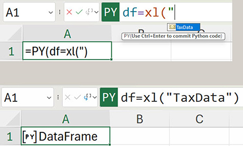
A Python cell can capture the query output using the xl() function — see Figure 1.
Remember to type =PY and press the Tab key before entering Python code.
When the opening double quotation marks are typed, the name of the query appears. Pressing the Tab key enters the query name. Pressing Ctrl and Shift and Enter enters the Python code.
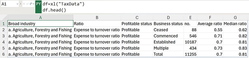
The following code previews the data structure.
The .head() command displays the first five rows — see Figure 2.
The .tail() command shows the last five rows — see Figure 3.
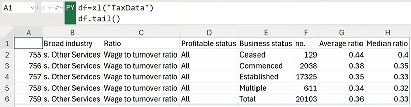
Typing a number between the parentheses in both these commands adjusts how many rows are displayed.
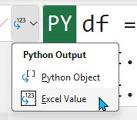
Use the Excel Values option on the drop down on the left of the Formula Bar to see the output (Figure 4).
ID numbers
Sometimes Python displays the row ID number — see column A in Figure 3. Python adds these numbers to the data (note the column doesn’t have a heading) to enable selection of specific rows.
Sampling
You can also sample the data using the .sample() command. Figure 5 shows 5 sample rows.
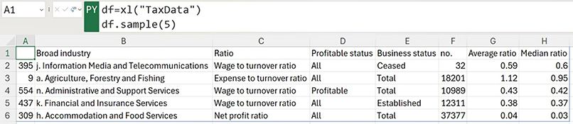
The sampled rows are chosen randomly and will change when re-calculated.
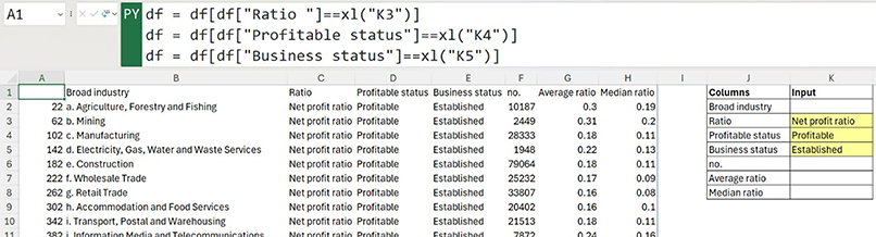
Filtering
The data can be filtered using cell entries — see Figure 6.
Creating charts
Python code can also create charts. The example that follows uses the MatPlotLib library. This library is automatically installed and the plt name is used to access its features. The library allows advanced visualisations.
The filtered list from Figure 6 can be used to create a chart. Displaying the chart requires an extra step.
First, write the code and then display as Excel Values. Figure 7 shows the result.
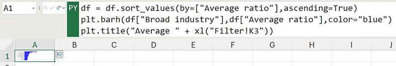
This code first sorts the Average ratio column from highest to lowest. It uses the plt variable to create a horizontal bar chart that shows the Broad industry column with the Average ratio values. The chart title is defined using the input cell from Figure 6.
The chart in cell A1 is too small to use, hence the extra step. Notice the icon to the right of cell A1 in Figure 7. Clicking that icon displays the chart — see Figure 8.
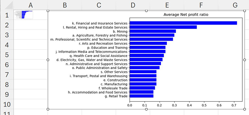
This is a chart image that can be re-sized and moved.
Fixing data
Power Query is Excel’s data cleansing (fixing) tool. Python can also perform data cleansing tasks with the advantage of not requiring refreshing.
Figure 9 has a formatted table (covered in previous articles) that is used to capture daily statistics for three retail stores based in WA. The table is called tblShops. Staff capture the daily data in this table.
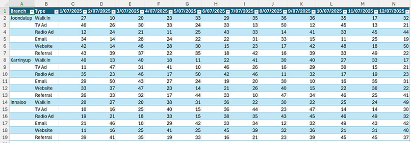
While this layout is easy to make new daily entries, it is difficult to summarise in a report.
I showed how to use Power Query to convert this style of input table into normalised data in this article.
A few lines of Python code converts this report layout into normalised data. The code and output table are shown in Figure 10.
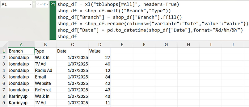
I used online Python resources to learn how to perform these steps. The lines of code are explained and demonstrated below. The shop_df variable captures the formatted table.
Let’s melt
I started with the Pandas .melt function. This takes horizontal data and turns it into vertical data. First the column or columns to keep are specified. In this case, the Branch and Type columns are retained. The other column entries are captured and displayed vertically as shown in the data table in Figure 11.
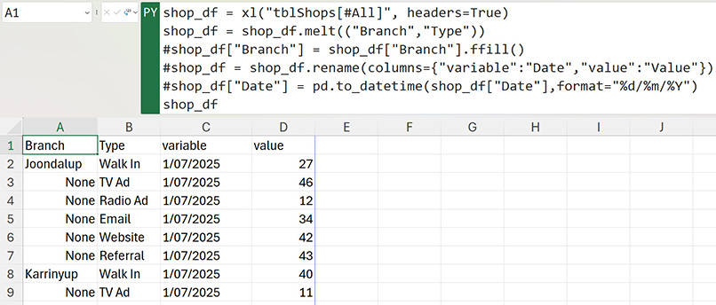
Commenting out code
Figure 11 demonstrates the use of the # symbol. Placing the # symbol in front of a line of code stops the code from executing. This symbol is typically used for comments about the code. This technique is called “commenting out” the code. If you are struggling with a line of code, then commenting it out stops it from running while also retaining it for future modification.
The table created in Figure 11 has three issues.
- There are missing branch entries in column A. None means the cell is blank. Python won’t display a blank cell, so None is displayed instead.
- The heading in cell C1 is not descriptive.
- The dates in column C are left-aligned and not treated as dates. Left-aligned entries in Excel are treated as text.
Python has built-in commands to handle all three issues.
Filling missing data
The .ffill() command fills the None cells in column A with the value from above. A separate line of code adjusts the column — see Figure 12. The shop_df variable is required as the last line to show the output.
Fixing headings
Headings can be renamed using the .rename() command. In this case, the variable column was renamed to Date and the value column was renamed to Value.
Fixing dates
There is a Pandas function that converts text into a date called .todatetime(). It requires a format to work with Australian dates.
Microsoft Copilot
Microsoft Copilot (the built-in AI interface) can assist in writing Python code for Excel. There are also lots of Python resources online. Remember that Python in Excel is not the same as Python. Python is a fully functioning programming language. Python in Excel is a cut down version of Python.
Python in Excel warnings
As mentioned in the first Python article, Microsoft have placed several limitations on the use of Python in Excel. The calculation speed can reduce when monthly limits are exceeded. A notification appears above the Excel grid. Clicking the Learn more button displays the dialog —see Figure 13.
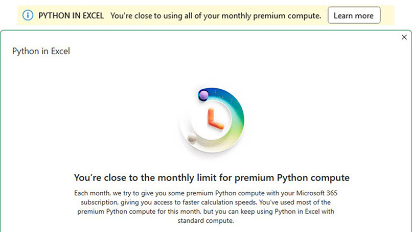
The premium Python compute can be purchased via a Python Add-on. There is a fee for the Add-on that can be paid monthly or annually.
On the free version there is also the possibly of receiving the #BLOCKED error message when an even larger monthly usage limit is exceeded. This stops Python from calculating. You may be able to get around this by having someone else in your organisation open your file.
Conclusion
Python in Excel is new. Start small and learn new skills as you go. Be consistent with variable names, which makes it easier to reuse code between files.
Consider creating a Python code snippets file where you capture and describe useful code to use in future projects. You can use # symbol to comment out code so it isn’t being run and using up the monthly Python quota.
Be careful how you use Python in Excel. Unless you are prepared to pay for the Python in Excel add-on, there is a chance your calculations could be slowed or even blocked. For any mission-critical operations this is an issue.
The companion video and Excel file will go into more detail to demonstrate these techniques.