Excel tips: DAX formulas for accounting reports

Loading component...
At a glance
DAX stands for Data Analysis eXpressions. DAX is the function language of PowerPivot in Excel and Power BI. DAX allows you to create automated, flexible reports based on related tables.
I covered the basics of PowerPivot, the Data Model and DAX in a previous article. This article builds upon the older article and assumes that you have read the previous article or have used PowerPivot before.
Excel’s spreadsheet functions work in two dimensions — rows and columns. DAX functions work in three dimensions: rows, columns and across multiple tables. The Data Model holds these tables and creates relationships between them like a relational database.
Most examples of DAX relate to sales, which is a straightforward concept to understand. Accounting reports are more complex and require more structure.
The following example will create a simple profit and loss report based on monthly trial balances. Once created, you just need to maintain the Accounts table to add any new accounts.
The examples use reasonably simple DAX formulas. This article is intended as an introduction to using DAX for accounting reports. Note that there are usually different ways to achieve the same outcome with DAX.
Tables required
There are three tables used for the report.
1. Trial balances
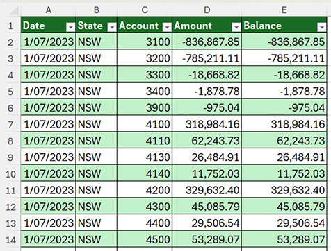
Figure 1 shows the structure of the trial balance table, with multiple months of data captured. In the Amount (monthly movement) and Balance columns, credits are shown as negative and debits are positive. The report requires values to be shown as positive. The table is named tblTrialBalances.
2. Chart of accounts
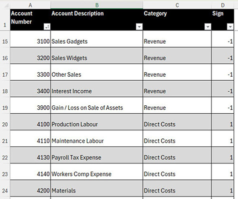
Figure 2 shows the layout of the charts of accounts. The Sign column will be used to convert the negative credits to a positive. The Category column will be used for the categories in the report. The table is named tblAccounts.
3. Date table
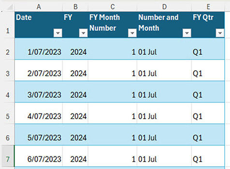
Figure 3 shows the date table. When working with date-based reports, it is important to have a date table in the Data Model. This makes working with the July to June financial year easier. The table is named tblDates.
Each of these tables has been added to the Data Model.
The next step is to create the relationships between the three tables. This is done in the PowerPivot window via the Diagram View (see Figure 4) on the right in the Home tab.

Click, hold and drag a field name onto the field name in another table to create the relationship. The field names can be different. The lines between the table in the Figure 4 appear once a relationship is created.
Note: The PowerPivot window can be left open and moved to a separate screen so you can work in the Excel grid and the PowerPivot window concurrently.
With these relationships created, the trial balance data can access the accounts data and the date data for the reports.
Measures
It is best practice to create a measure for each value that will be included in the report. A measure is a calculation using DAX functions. A measure can access entries across multiple tables based on the relationships created.
Companion video
The companion video will go into more detail and demonstrate useful techniques to use for testing the measures as they are created.
New measure
The Amount column has the monthly movement. To create a measure, use the Measures drop down (see Figure 5) on the PowerPivot ribbon tab and choose New Measure.

Debits and credits
The first issue to resolve is that trial balance credit values are shown as negatives. The report needs to show values as positive. The Sign column in the tblAccounts table allows us to correct the sign.
Measure — Report Amount
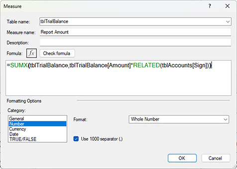
The SUMX function shown in Figure 6 is an iterator function.
Iterator functions work through a table row-by-row and perform calculations. In this case, on a row-by-row basis it multiplies the value in the Amount column from the tblTrialBalance table by the related sign for the account from the tblAccounts table. It then adds up the adjusted values.
The Report Amount measure in Figure 6 is a workings measure. It will not be used in the final reports.
The report amount can now be created for the various lines in the profit and loss report.
Columns, fields and measures
In Excel, we refer to columns in a table. In database terms, these are called fields.
When referring to a field (column) in DAX, best practice is to always include the table name and the field name enclosed in square brackets.
When referring to a measure, it is best practice to never include the table name. Only use the measure name between square brackets.
Using this convention makes it easier to identify a field and a measure in DAX formulas.
Revenue measure
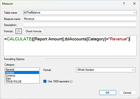
The Revenue measure uses the CALCULATE function to limit the Report Month measure to just the revenue items. See Figure 7.
In this case, the CALCULATE function works like Excel’s SUMIFS function. The Report Month measure only adds up the accounts with Revenue in the Category column in the tblAccounts table.
Two other measures use the same DAX pattern. All three measures and their formulas are listed in Table 1. They use the same format as the Revenue measure.

These three measures form the basis of the report. The report requires margin and profit measures. Table 2 shows the DAX formulas for these other measures.

The DIVIDE function avoids divide-by-zero errors. Both percentage measures use a percentage format.
Once these measures have been created, the following reports can be created.
Figure 8 shows a report by state and financial year.

Figure 9 has a report by financial year with a State filter.

Figure 10 has a monthly report by state and financial year with quarterly totals.
Detailed DAX reports
It is possible to create more detailed reports using DAX. This typically requires more complex DAX formulas.
Listing measures vertically
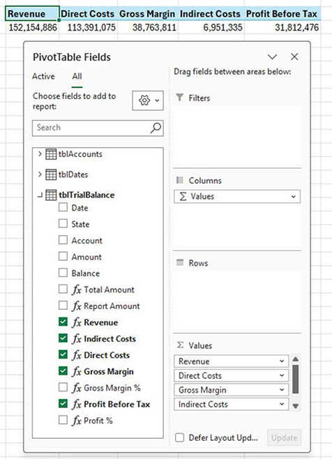
When you first add the measures to the PivotTable report they may be listed horizontally — see Figure 11.
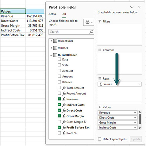
To change the listing to vertical, drag the ∑ Values entry from the Columns section (shown in Figure 11) to the Rows section — see Figure 12. You can then add other fields to the report.
PivotTable layout tip
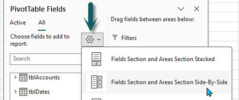
The layout of the PivotTables Fields dialog in Figures 11 and 12 can be accessed via the settings icon. See Figure 13.
The second option displays more fields (columns) and measures vertically on the left of the dialog, making them easier to select.
DAX reports
DAX reports require a set up phase, a testing phase and a running and maintenance phase. Once the measures have been created and tested, they can be used in other reports.
Artificial intelligence
AI systems can write useful DAX functions, but be sure to test them extensively as they can makes mistakes. AI systems can also help to fix DAX formulas that may not be working as expected and offer alternative solutions.
The companion video and Excel files (blank and complete) go into more detail to demonstrate these techniques.