Loading component...
At a glance
Heat maps are visualisations that use a darker colour for higher values and a lighter colour for lower values. The colours can be reversed if lower values are more important.
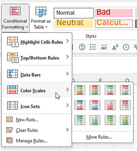
In Excel, heat maps are called “Color Scales” and can be found in the Conditional Formatting drop-down on the Home ribbon – see Figure 1.
Even though there are 12 icons there are only four different options – the extra icons allow the selection of standard colours.
- High to low with a 3-colour scale
- High to low with a 2-colour scale
- Low to high with a 3-colour scale
- Low to high with a 2-colour scale
The high to low option means the higher the score the better, for instance, to show sales or profit.
The low to high option means the lower the score the better, for instance, to show costs or a golf score.
A classic heat map uses the 2-colour scale rather than the 3-colour scale. The 3-colour scale heat map may be too colourful to be useful.
Colour blindness
When choosing colours for conditional formats, be aware that colour blindness affects about one in 12 men and about one in 100 women. The most common form of colour blindness affects the recognition of red and green.
This means the typical “green is good/red is bad” colour combination can be difficult for people with colour blindness to see.
Three safe colours for colour blindness are blue, orange and grey.
Worked example
With sales data from 2023–24, the heat map in Figure 2 shows daily sales for the year.
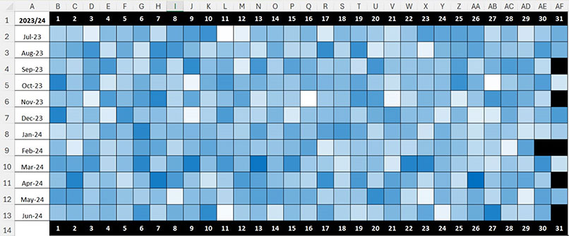
The range B2:AF13 has formulas that returns the sales value for that day. Illegal dates (like 31 June) return a blank cell. A custom format has been applied to hide the values.
The darker the blue, the higher the sales. The white cells represent the lowest sales. The sales data was randomly generated, so there aren’t many patterns in the heat map.
Date-based heat maps are useful for visualising and interpreting seasonal data, as well as for predictable special occasion dates like Christmas, Easter, Mother’s Day and Father’s Day.
The settings for the conditional format on the range B2:AF13 are shown in Figure 3.
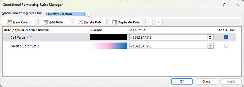
The first rule displays the illegal dates such 31 June as a black cell. The ticked box on the end of the rule means that if the rule is applied, then no further rules are applied.
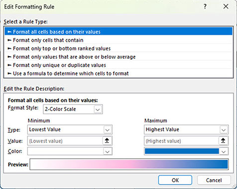
The second rule is the 2-colour scale, which is shown in Figure 4.
Although this data was randomly generated, there are some insights that can be gleaned from it.
In addition to heat maps, there are other types of conditional formatting worth exploring.
Top/Bottom Rules
This formats only the top or bottom-ranked values.
Consider identifying the highest and lowest 12 values to see if there is a pattern in the data.
For example, Figure 5 shows a blue colour applied to the top 12 sales days and orange applied to the bottom 12 sales days.
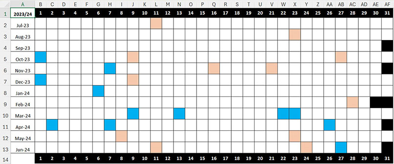
The darkness of the colour doesn’t vary in this visualisation.
It can now be seen that the top 12 sales days were all on or after 1 October. March and April 2024 accounted for seven of the 12 top sales days.
The lowest 12 sales days were more evenly distributed throughout the year. Fewer colours make this more obvious.
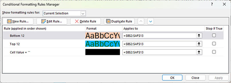
The conditional format settings are shown in Figure 6.
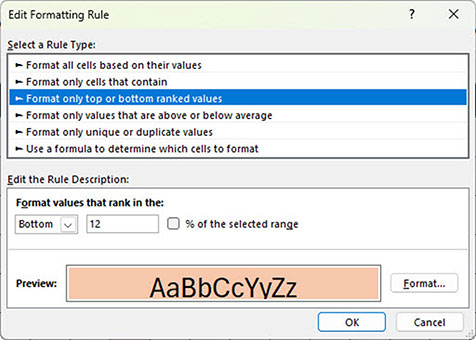
The “Bottom 12” settings are shown in Figure 7.
Conditional format interaction
Many conditional formats can link to cells on the sheet, so that the conditional format can be adjusted by changing a cell value. Unfortunately, the top and bottom rule dialogs (Figure 7) do not allow for that type of interaction.
Formulas can be used to create an interactive top/bottom conditional format.
Excel has two functions that help with this, called LARGE and SMALL.
These can identify, for example, the 12th largest value in a range and the 12th smallest value in a range. The syntax is straightforward. The first argument is the range to examine. The second argument is the value position number to find.

Figure 8 shows a section to the right of the grid that has an input cell for the number of items. The two calculation cells identify the 12th highest value and the 12th lowest value.
The formula in cell AK2 is:
=LARGE(B2:AF13,AJ2)
The formula in cell AL2 is:
=SMALL(B2:AF13,AJ2)
These two calculated values can be used with formula-based conditional formats to create an interactive top and bottom format.
To apply the conditional format, follow these steps.
1. Select the range B2:AF13.
2. On the Home ribbon, click the Conditional Formatting drop-down and select New Rule.
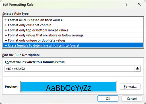
3. In the dialog that opens, select the last option in the top section that starts with “Use a formula” – see Figure 9.
4. In the Format values … box, enter the following formula:
=B2>=$AK$2
5. Click the Format button, select the Fill tab, select blue and click OK.
6. Click OK to apply the format.
More than 12 cells will be highlighted in blue. The “illegal” dates like 31 June will also be highlighted. To change them to black, follow the same six steps above but use the following formula in step 4:
=B2=""
Then, in step 5, select black.
Conditional format formula requirements
The formula for the conditional format needs to be created in a certain way to work across the whole range. The formula must return TRUE to apply the format.
The formula must reference the top-left cell of the range (in this case, cell B2), and it must use a relative reference. No $ signs should be used.
The cell to compare to must be a fixed reference as per $AK$2. In Figure 9, the format will be applied based on comparison of each cell’s value to cell AK2.
To apply the bottom 12 rule, follow the same six steps as in the previous section, but use the following formula in step 4:
=B2<=$AL$2
Then, in step 5, choose orange.
Changing cell AJ2 updates the formats – see Figure 10.
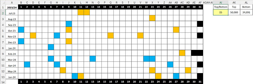
Note: This technique may show more than the number chosen if there is a tie for that position.
Using conditional formats to apply colours can enable insights into the data based on pattern identification.
The companion video and Excel files (Blank and Completed) will go into more detail to demonstrate these techniques.

