Loading component...
At a glance
The Pareto Principle (also commonly known as the 80/20 rule or ‘the law of the vital few’) states that 80 per cent of results come from 20 per cent of causes.
For example, a common business example is that 80 per cent of sales come from 20 per cent of clients. Therefore, focussing efforts on the top 20 per cent can maximise the returns on effort.
The other side of the rule is that 80 per cent of the clients only provide 20 per cent of the revenue.
Note: The Pareto Principle is based on measuring percentages and 80%+20%=100%. This is just a coincidence. It is not required that the two percentages measured equal 100 per cent. In practice, 75 per cent of sales may be driven by 15 per cent of clients.
The 80/20 rule can help you identify the areas where you need to focus as well as those areas you may be able to ignore.
Excel has incorporated Pareto analysis into many of its features.
When reviewing the data to identify 80/20 relationships, it can be worthwhile to segment the data. For example, segmenting sales by states or regions could provide further insight. Excel enables segmentation analysis with its built-in filtering functions and features.
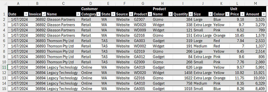
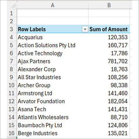
Sales data
Sales data will be used to demonstrate the Pareto features. The headings and sample data are shown in Figure 1. The formatted table is named tblSales. Sales will be analysed by client.
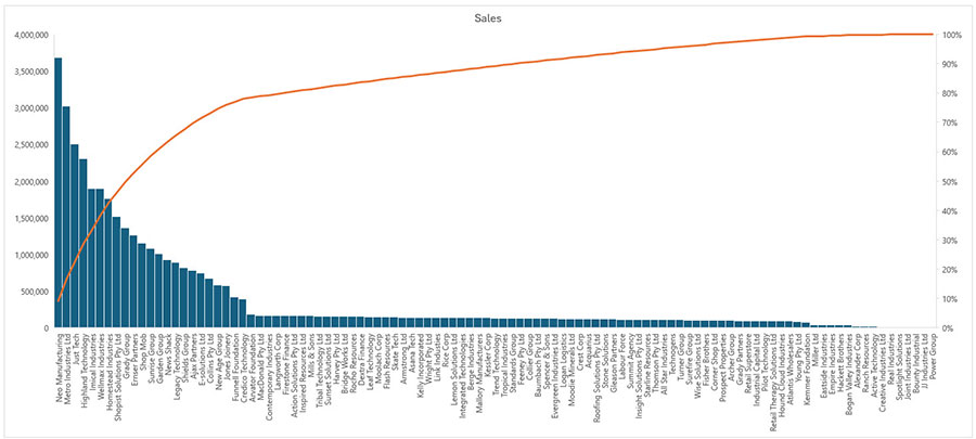
Pareto chart
A Pareto chart (Figure 2) is a built-in chart that is a combination of a Column chart (left axis) and a Line chart (right axis). The Line chart plots the cumulative percentage.
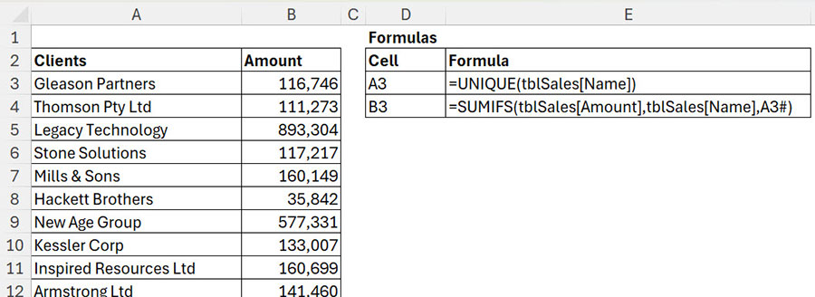
To create a Pareto chart, you need a list of entries with values. In the subscription version of Excel, the UNIQUE and SUMIFS functions can be used to create the report – see Figure 3.
When creating a Pareto chart, Excel automatically sorts the value categories from highest to lowest (left to right). The Line chart then plots the cumulative percentage from left to right. The Line chart typically rises quickly and then gradually levels out and flattens.
Unfortunately, Excel’s Pareto charts omit two useful components. Pareto charts don’t include a horizontal 80 per cent line or allow gridlines based on the right-hand percentage axis.
This makes it difficult to identify where the cumulative line crosses the 80 per cent threshold.
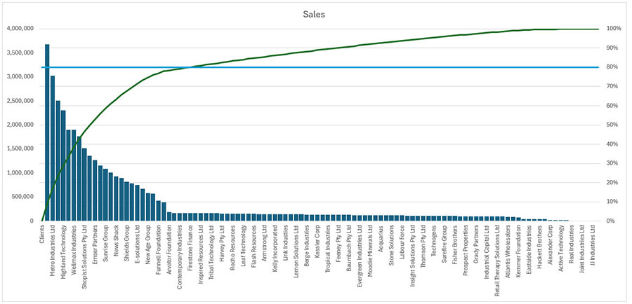
Combo chart
Excel can combine chart types into a single chart. By combining a column and a line chart, we can mimic a Pareto chart and overcome the two limitations.
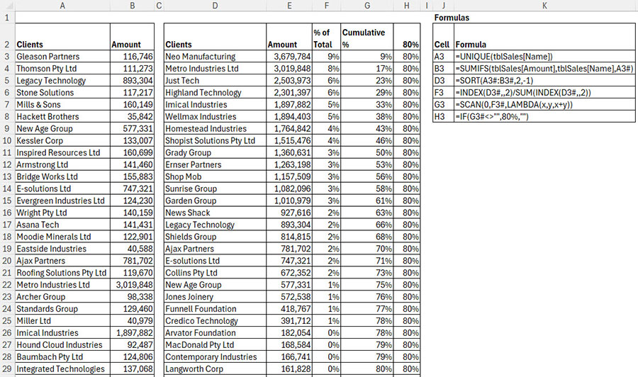
The structure and formulas required for the Combo chart are shown in Figure 4.
To create the Combo chart, follow these steps.
1. Hide column F. These percentages are not required.
2. Select cell D2 and press Ctrl + A this selects the whole table.
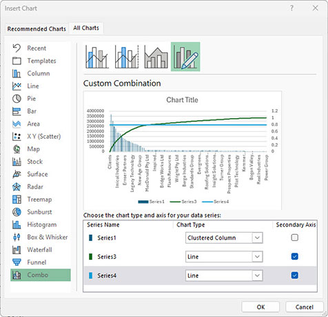
3. Click the Insert tab, click the Recommended Charts icon. Click the All Charts tab and click the Combo option on the bottom left.
4. Make sure Series 3 and 4 are both Line charts (change via the drop-down).
5. Use the checkboxes to change Series 3 and 4 to use the Secondary Axis – see Figure 5. Click OK to create the chart.
The completed Combo chart is shown in Figure 6. Note: This chart includes a few extra modifications that will be explained in the companion video (above).
PivotTables
A PivotTable report for client sales in shown in Figure 7.
Unfortunately, you can’t use a PivotTable as the source for a Pareto Chart. Adding extra columns can make Pareto analysis easier. The companion video (above) will demonstrate creating this report, plus the techniques that follow.
Sorting
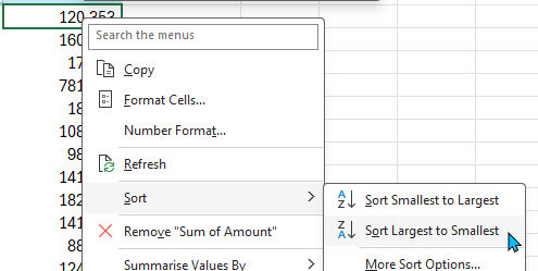
Right click cell B4 in the PivotTable and choose Sort, then Sort Largest to Smallest – see Figure 8.
This places the largest values at the top of the report.
Extra columns
A little-known technique enables adding a column multiple times to the Values section of a PivotTable. These extra columns can display percentage-based and other calculations.
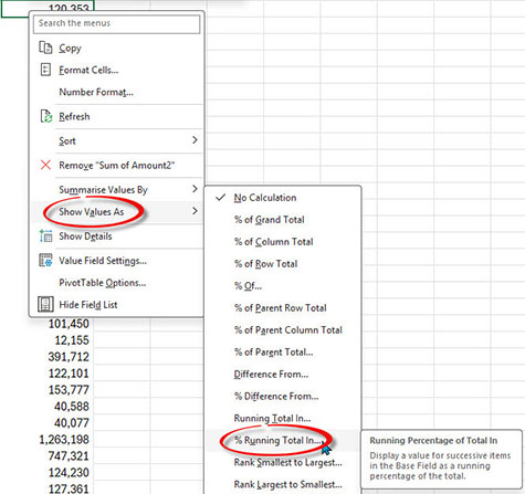
Drag the Amount column to the Values section of the PivotTable. This duplicates the existing values. Right click a value in the new column and choose Show Values As and then then choose % Running Total In… – see Figure 9.
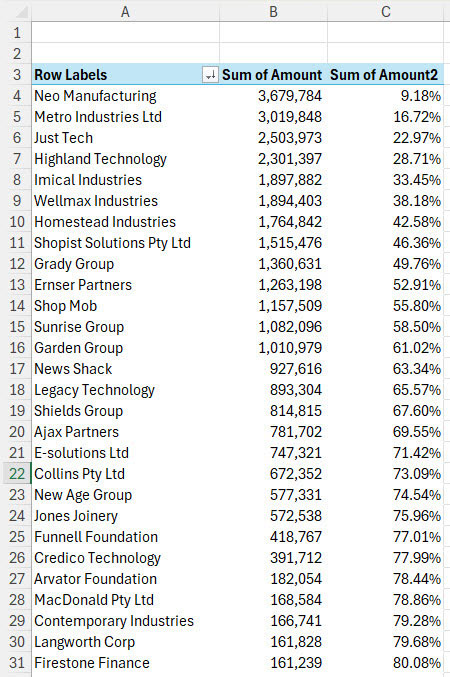
Click OK in the dialog that appears. See the amended report in Figure 10.
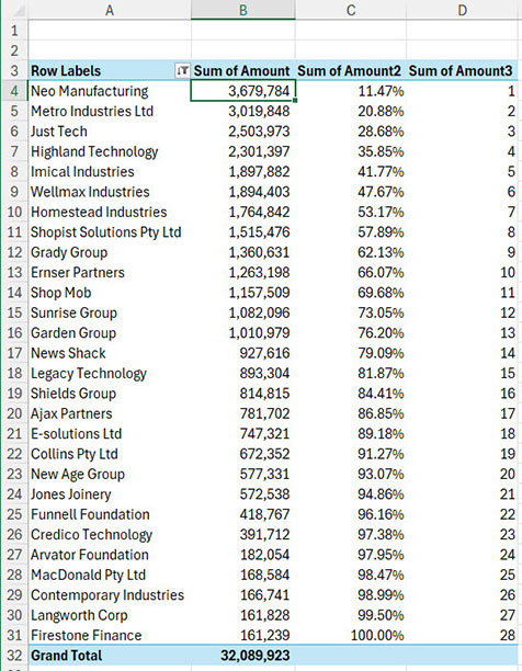
Since PivotTable values start on row 4, you may want to add a Rank to the report which makes counting the number of clients easier.
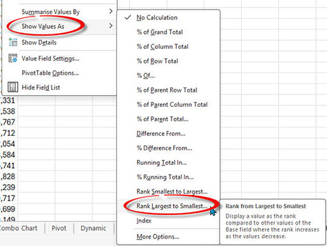
Add the Amount column to Value section again. Right click the new column and choose Show Values As and then choose Rank Largest to Smallest, click OK in the dialog that displays. See Figure 11.
The updated report is shown in Figure 12.
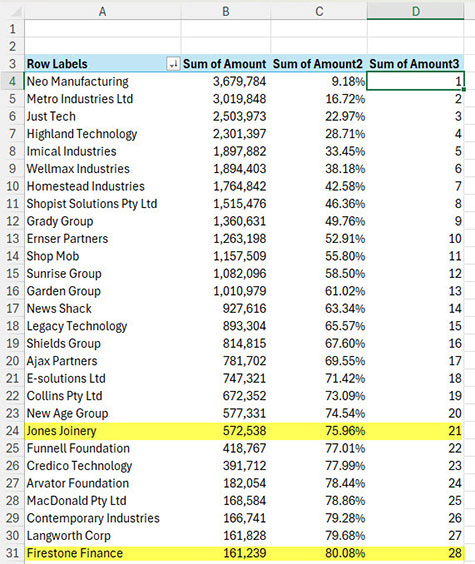
There are 105 customers. The top 21 customers (20 per cent) account for 76 per cent of sales.
The 80 per cent sales level (row 31) is reached at 28 customers or 27 per cent of customers.
Segments
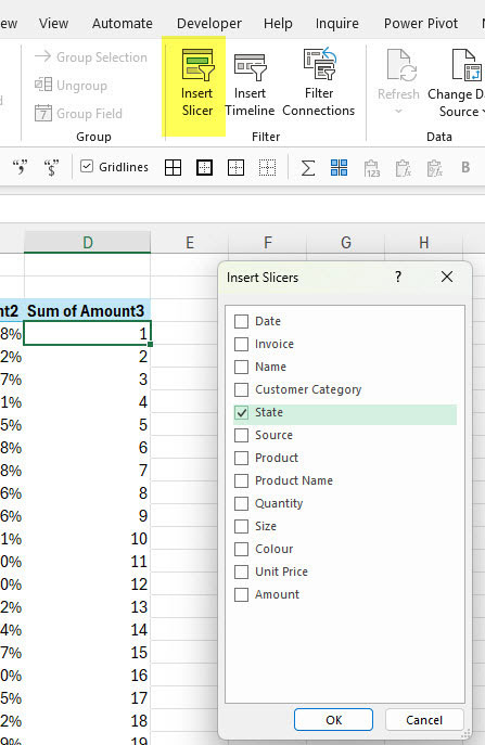
PivotTables enable segmentation analysis. The above report can be changed to work with individual states. Adding a Slicer simplifies making a state report.
With a cell selected in the PivotTable, click the PivotTable Analyze tab and click the Insert Slicer icon. Tick the State option, click OK – see Figure 13.
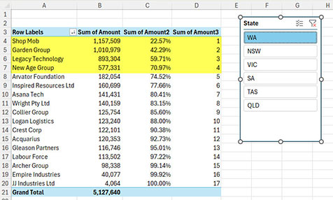
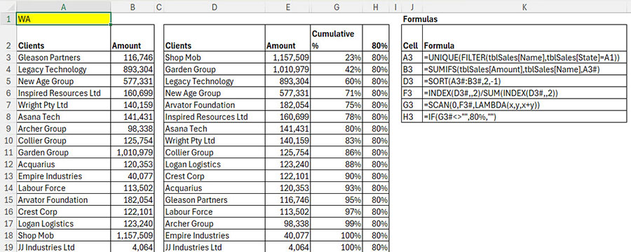
Choose a state to update the report. In Figure 14, WA’s top four clients account for 70 per cent of sales.
Filtering
Excel’s filtering options include the ability to list the top 80 per cent of customers by value. This can be applied to a PivotTable.
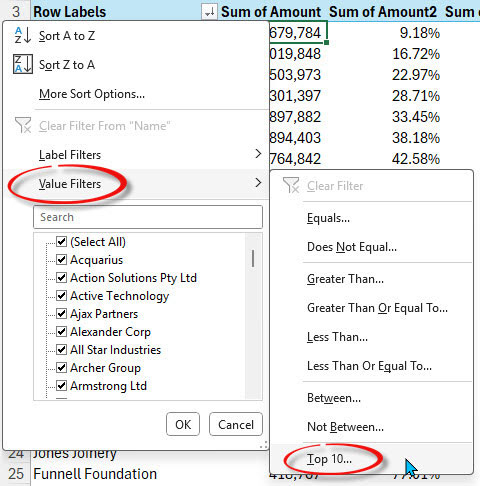
Click the filter icon for the Row Labels in cell A3. Click Value Filters then choose Top 10 – see Figure 15.
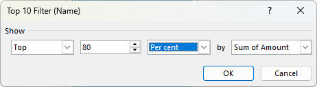
In the dialog that opens, change 10 to 80. Change Items to Per cent and click OK, as per Figure 16.
The revised report with no state filter applied is shown in Figure 17.
As new data is added to the data table, refreshing the PivotTable will update the report. The two extra Amount columns in this report are no longer required and can be removed.
Formula-based segment solution
This formula-based solution report can be modified to filter by state. Assuming the state is in cell A1, then the only modification required is to change the formula in cell A3 to
=UNIQUE(FILTER(tblSales[Name],tblSales[State]=A1))
The report in Figure 18 now lists the customers with WA sales.
Conditional Formats
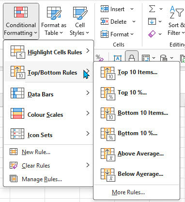
Conditional Formatting on the Home ribbon tab has a similar option to the Filter Top 10 – see Figure 19.
These options are just as flexible as the Filter options, so the values used can be changed.
This article demonstrates using the Top/Bottom rules in Conditional Formatting and how interaction can be added.
Pareto analysis can help identify the most important areas to focus on and, just as importantly, help identify those areas that may not be worth the effort.
The companion video and Excel file will go into more detail to demonstrate these techniques.