Loading component...
At a glance
Let’s say you need to keep track of a few key metrics that come from different systems. These may be required as part of a reporting or dashboarding system. The metrics may be important, but are too hard or too expensive to automate. As a last resort, you decide to capture them manually.
This solution will cover creating a database that has an input sheet and a separate data sheet. The data sheet will be the data source for pivot tables or pivot charts. The solution requires Power Query. Power Query is built into Excel 2016 and later versions. Power Query is available for Excel 2010 and Excel 2013 as a free Microsoft add-in.
Data entry
The easiest layout to enter data into is not the best layout to extract data from. For this reason, we will have separate sheets for input and data.
In the past, converting from an input structure to a data layout was usually done with a macro.
Power query solution
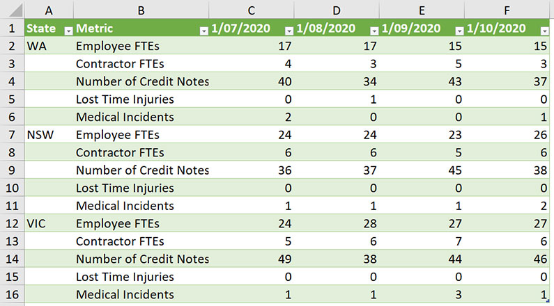
The table in Figure 01 is used for manual input, and is in a sheet called Input. To keep columns A and B visible as you scroll to the right, you can use Freeze Panes (View ribbon). There are two static columns, State and Metric. You can have as many static columns as you need. These static columns are important, as they are retained in the final data table – I will mention them again in the instructions below.

I have also made this table a formatted table using the Format as Table icon (Home ribbon). Formatted tables work seamlessly with Power Query. Formatted tables automatically expand their rows and columns as new data is added. The table is named tblInput. I use a prefix of tbl for all my table names to differentiate them from range names, which I also use frequently.
Each month’s results are entered in a column. This layout allows you to have multiple years’ data in the input table – you just keep adding columns to the right. We will use Power Query to convert this horizontal input layout into a normalised vertical data set.
Note that, in Figure 01, the dates that are used as headings are not treated as dates. Notice that they are left-aligned. This is a clue that Excel is treating them as text. Proper dates are right-aligned. I am not sure why, but real dates are not permitted as headings in formatted tables. Formulas are also not permitted as headings in formatted tables.
Instructions
These instructions relate to Excel 2016 and later versions. In earlier versions, you click on the Power Query ribbon tab. Click inside the formatted table and click the Data ribbon tab.
Click the From Table/Range icon (left side of ribbon).
The Power Query window opens. This window is separate from Excel. While this window is open, you can’t access the spreadsheet. The table is imported into this window.
In the State column, the state codes are not listed in every row. In a data listing, they need to be repeated. There is a built-in feature that fixes this problem in Power Query.
Right-click the State column header and choose Fill, then choose Down. The state rows are now all populated.
Select the State column, hold down the Ctrl key down and select the Metric column. Rightclick one of the selected column headers and choose Unpivot Other Columns.
In this step, you must select all the columns you want to retain as is in the final output, which I have called static columns. This step creates the final data layout we require.
Two new columns are created that combine all the entries from all the other columns.
The first new column is called Attribute, and it holds all the dates.
The second new column is called Value, and it holds all the entries. We can rename the Attribute column to Date. Double-click the Attribute column heading and change it to Date.
The dates are currently left-aligned, and you may notice the icon on the left of the Date column has an ABC icon. This means they are currently treated as text. We need to change the column to a date.
Click the icon on the left of the Date column heading, and choose the Date data type.
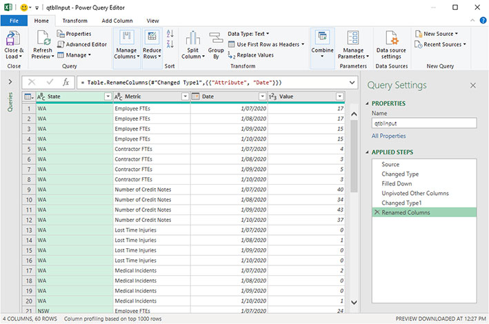
On the right-hand side of the Power Query screen, several Applied Steps are listed.
These are all the steps we have performed so far. These steps will be repeated in sequence whenever the data is refreshed.
To avoid confusion, add a q to the front of the Name on the right of screen, so it is qtblInput. The final query is shown in Figure 02.


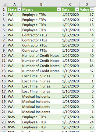
On the Home ribbon, on the far left, click the Close and Load icon, and a new sheet will be created containing the new data layout. The top section of the final layout is shown in Figure 03.
You can rename the sheet to Data, and this will not impact the query.
This data layout is the preferred way to store data. Generally, databases tend to be more efficient if they have fewer columns and more rows.
Refreshing
Adding or inserting new rows or columns to the input table will normally flow through to the output data table when it is refreshed.
If you amend figures in the input table, you also need to refresh the output table to update the values. To refresh the output table in the Data tab, right-click any cell in the table and select Refresh. The exception to this automatic update is if you add an extra static column, a column you want to retain in the final data table. Adding a new static column will require you to edit the Power Query to include that extra column.
I demonstrate how to do this in the video, which you can watch by clicking the button at the top of the page. This output table structure is a good data source for a pivot table or pivot chart report. As I mentioned earlier, Excel is not a database, but for small data sets it can fill a gap and allow you to easily capture, store and use those figures that may be too difficult to capture automatically.
The companion video and Excel files (blank and complete) will go into more detail to demonstrate these techniques.
Neale Blackwood CPA runs A4 Accounting, providing Excel training, webinars and consulting. Questions can be sent to [email protected]

